nursena yilmaz ezgi koksal moleskinerie logo competiton by ezgi koksal from italy
designer's own words:
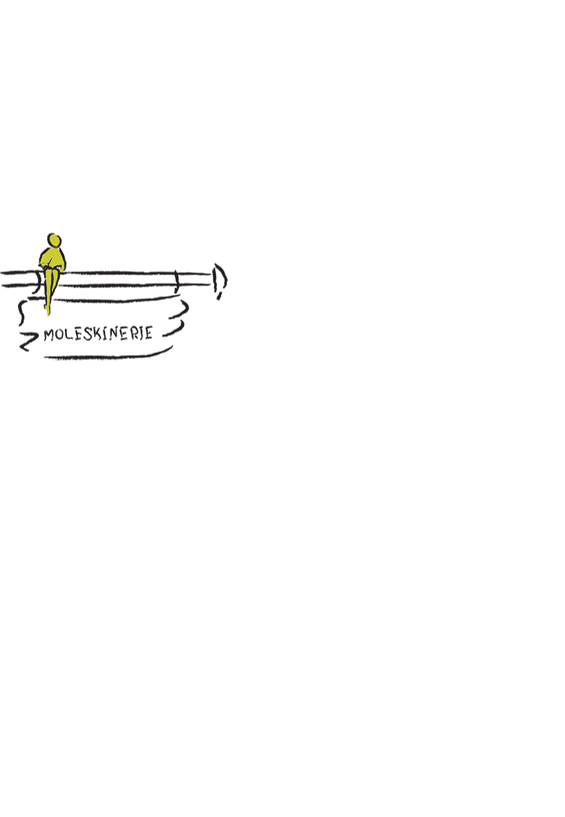
moleskine has been more like a tradition than just a notebook. people carry these notebooks with them to anywhere they go. moleskine possessed the details of their lives, their inspirations, their plans. so with this design we tried to reflect the constant existence of moleskin in peoples lives. the design basically tells a man writing or drawing on his moleskine notebook while sitting down on fences which would give the feeling of traveling. and with the people, notebooks travel too. what is so special about these notebooks are they are nomadic. we believe our design represents that. we chose to have a cartoonish character because it would look more simple and more elegant. and moleskine is all about the simplicity and elegance. moreover a design too complicated would not be able to express what moleskinerie is. the design is drawn with hand first and then created with the help of softwares like illustrator and photoshop. you can see the moleskinerie is not written with the usual moleskine font but can be read easily. we also have a version with the moleskine font but we felt like the texture of them together did not feel right. it was more about the brush stroke so we changed it but it can be used either way. we feel like the design does fit the characteristics of the moleskinerie and would be easily accepted by the audience. we believe it represents moleskinerie the way peope always see it. it is not just a notebook but something you carry to everywhere and can not do without.
logo for moleskinerie
 logo with the moleskine font