nomadic brand moleskinerie by claudia kircher from switzerland
designer's own words:
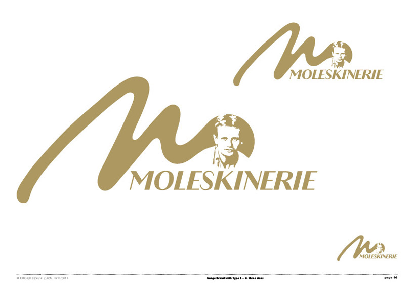
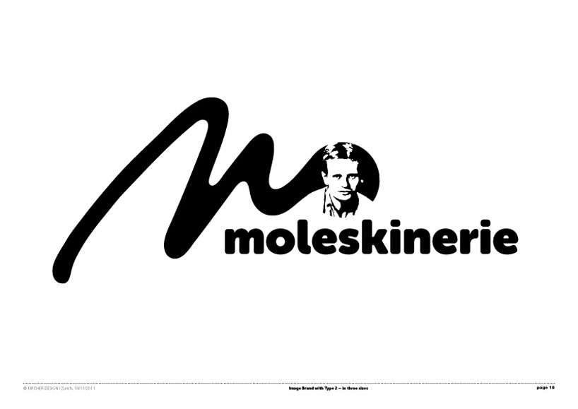
nomadic brand image
«Bruce Chatwin – his image on a coin»
I see the gold coin as a symbol for travel, quality and durability. In honour of Bruce Chatwin, I have designed a coin bearing his image.
«m – handwritten»
I have created the „m“ design to show movement as an emotional and creative expression, which I see as the basis for the Moleskine brand.
«A nomadic „m“ like the nomdic way of life of Bruce Chatwin.» The symbol is organic like us. I see the form as a nomadic path,
the beginning of a journey, the start of a story.
«Creating a brand image»
With the combination of the coin and the „m“, the design is eye-catching, distinctive and unique – which is Moleskine!
«Colouring»
Black, white, cyan or gold I suggest should be the primary colours,
but like a chameleon it can be all colours of the spectrum – but always one single colour.
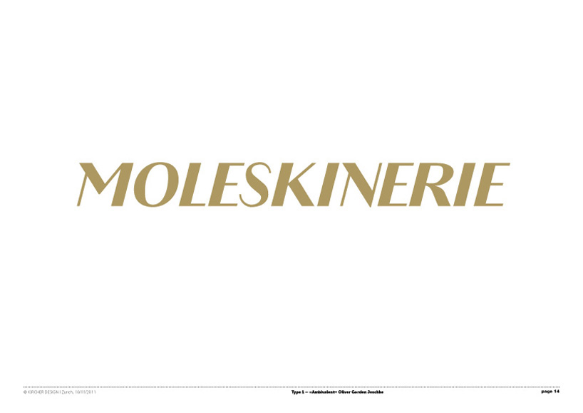
«Type»
The first type «Ambivalent» and was sketched by Designer Oliver Jeschke. ‚Moleskinerie–Headline‘ is a simple interpretation of a neo–classical as well
as baroque minded grotesque type specially designed for ‚Moleskinerie‘. By the angular, stiff straight lines the type forms the contrast to the
organic brand image. The name ‚Ambivalent‘ (lat. ambo „both“ and valere „are valid“ ) comes from thick-thinly of the letters. Suitably also for Bruce
Chatwin.
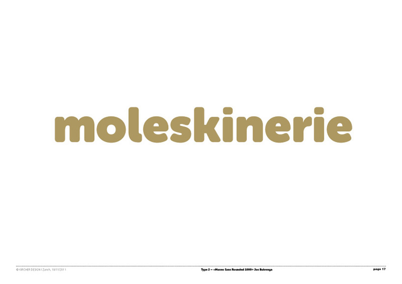
The second type «Museo Sans Rounded» Fonts by Designer Jos Buivenga ... gently unsharpened ... that‘s Museo Sans Rounded. It doesn‘t have italics, but is does have a very heavy 1000 weight. The spacing and kerning has been optimized for display use.
1/ nomadic brand_1 / Type 1
 2/ nomadic brand_2/ black with outline and shadow
 3/ nomadic brand_3 / gold / Type 1
 4/ nomadic brand_4 / Type 2
 5/ nomadic brand_5 / black / Type 2
 6/ nomadic brand_6 / free place for another image