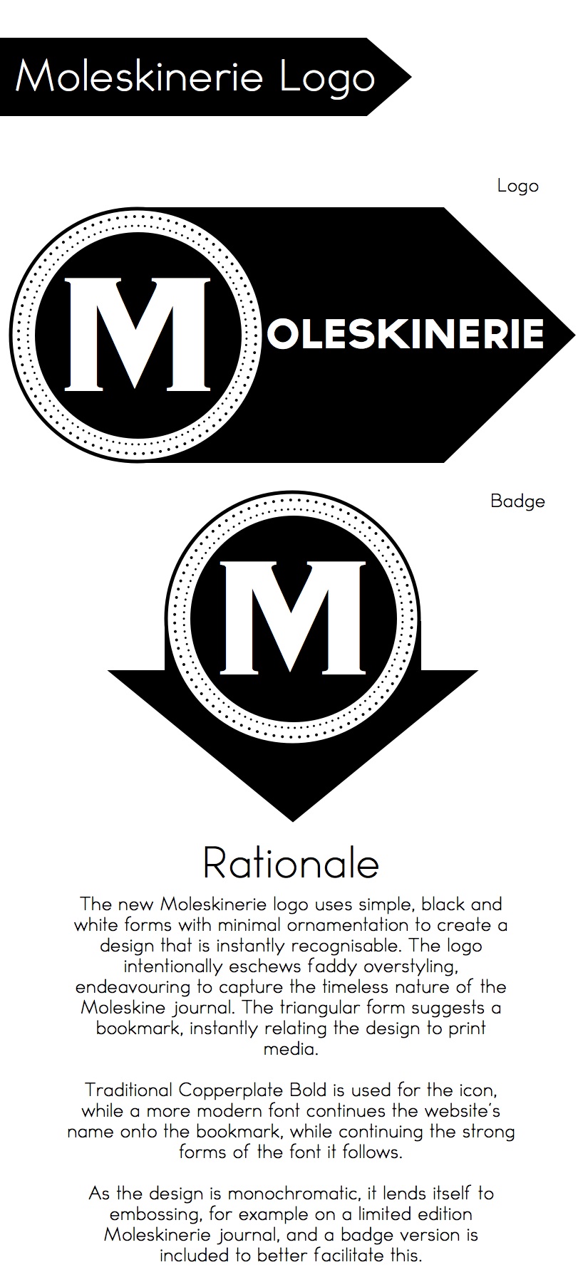
New Moleskinerie Logo by chris thomas from australia
designer's own words:
The new Moleskinerie logo uses simple, black and white forms with minimal ornamentation to create a design that is instantly recognisable. The logo intentionally eschews faddy overstyling, endeavouring to capture the timeless nature of the Moleskine journal. The triangular form suggests a bookmark, instantly relating the design to print media.
Traditional Copperplate Bold is used for the icon, while a more modern font continues the website’s name onto the bookmark, while continuing the strong forms of the font it follows.
As the design is monochromatic, it lends itself to embossing, for example on a limited edition Moleskinerie journal, and a badge version is included to better facilitate this.
Moleskinerie Logo
shortlisted entries (2162)