New Combine for New Moleskine by joon hwang from usa
designer's own words:
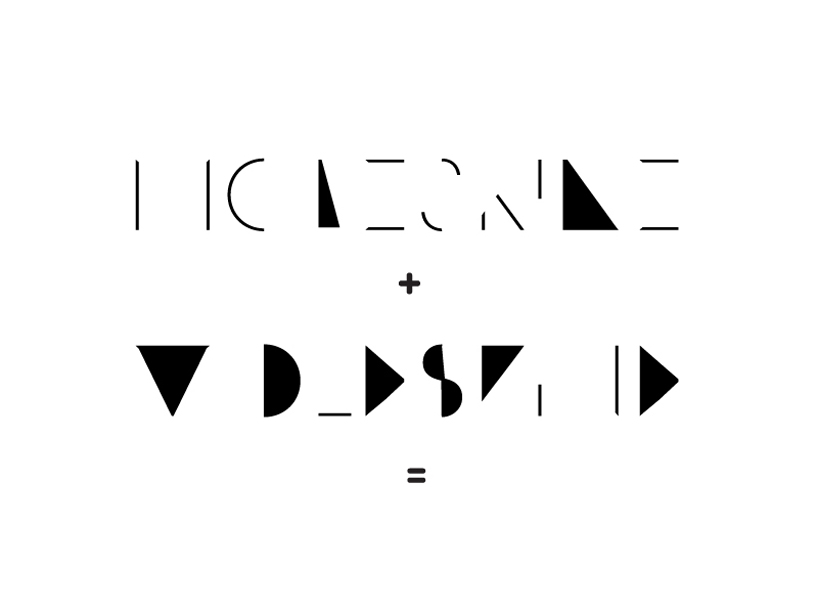
Since Moleskine brand carries with itself a rich history, owners of notebooks find meanings beyond pride. Therefore I wanted to give my design a special meaning different from others, with creativity that breaks away from conventional mold. By breaking stereotypes within existing font, I have shaped and combined design's fundamental figures such as straight line, circle, triangle and others. In a way this may appear to be just signs and symbols but in respect this can focus people's attention much more. Furthermore, this design can be recognized by people as one of Moleskine's distinct characteristics.
Combine +
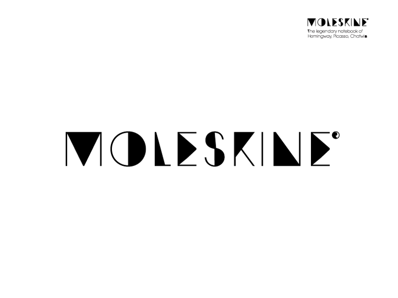 = NEW
= NEW
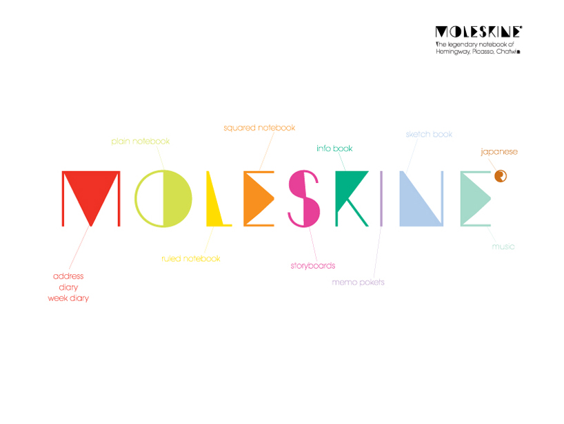 Colors
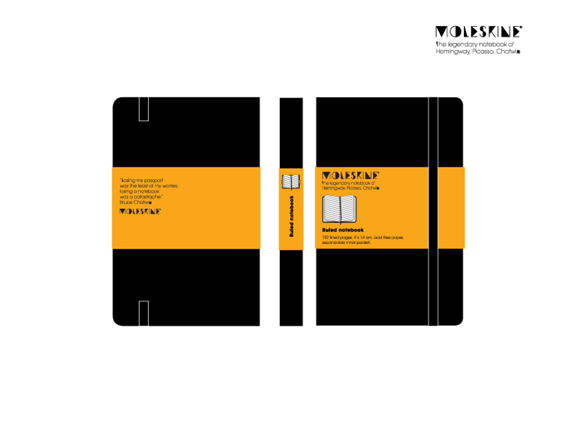 New Look
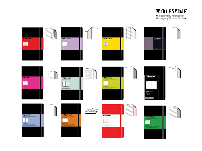 Colors
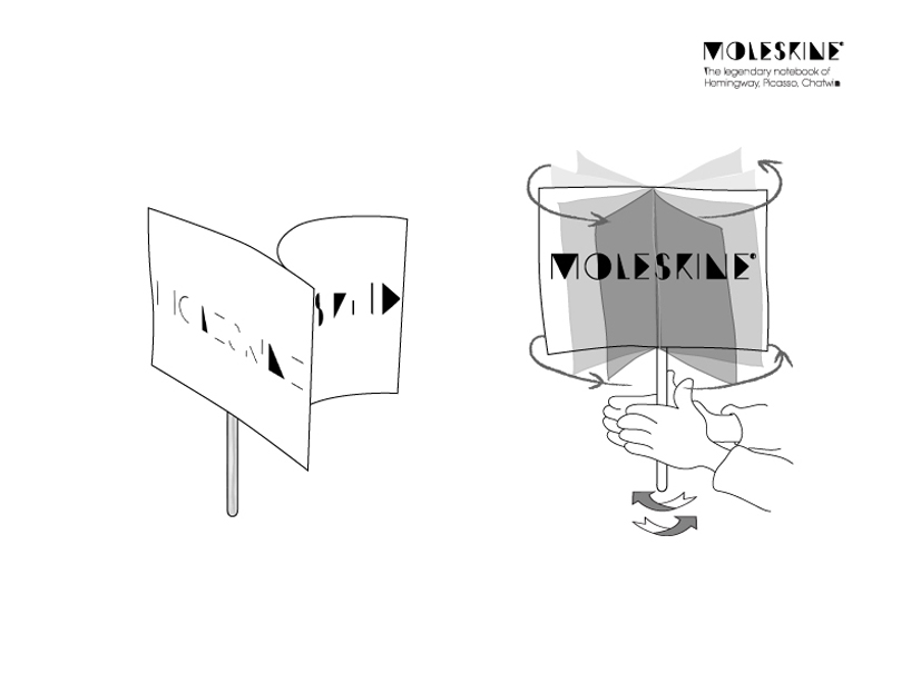 Have a fun!
shortlisted entries (2162)