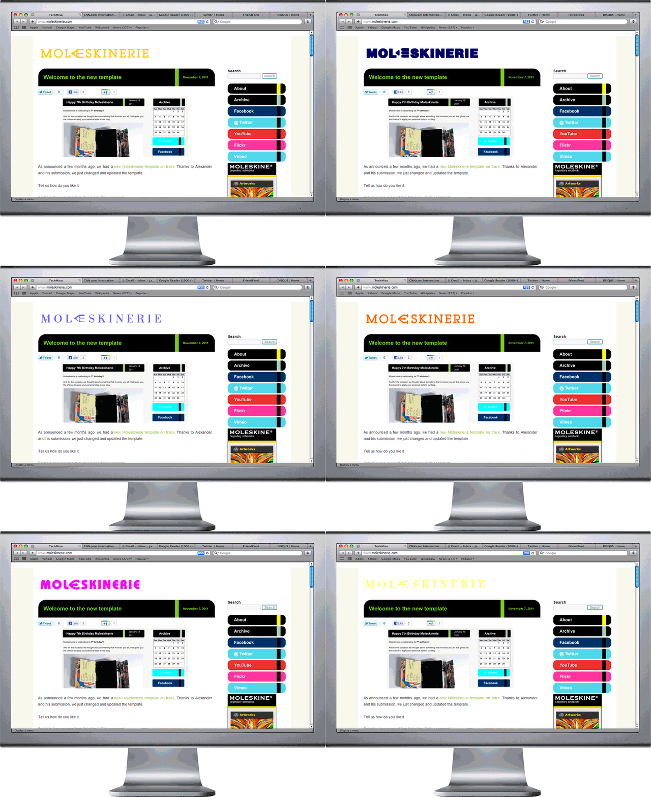
new characters by aleksei mikhailov from russia
designer's own words:
modern logos had long been not a well-defined, fixed inscriptions and/or pictures. a modern, effective logo - is not fixed once and for ever image, but rather, a kind of rule that you can create a lot of very different images and styles without loosing there recognition. as a good examples we may mention the logo of melbourne (http://logodesignerblog.com/melbourne-logo-design/) or aol (http://dennytu.wordpress.com/2009/12/23/aol-reveals-new-brand-logotype/) and hundreds other ones.
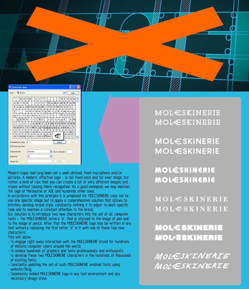
in accordance with this principle it is proposed for moleskinerie case not to use one specific image but to apply a comprehensive solution that allows to infinitely develop brand style, constantly refining it to adjust to each specific task and to maintain a constant attention to the brand.
our solution is to introduce two new characters into the set of all computer fonts - the moleskinerie letters "e", that is stylized to the image of pen and to the image of pencil. after that the moleskinerie logo may be written in any font withonly replacing the first letter "e" in it with one of these two new characters!
this will allow:
- to engage right away interaction with the moleskinerie brand for hundreds of millions computer users around the world;
- to enable hundreds of graphics and fonts professionals and enthusiasts to develop these two moleskinerie characters in the hundreds of thousands of existing fonts;
- constantly updating the set of such moleskinerie enabled fonts using website/blog;
- seamlessly embed moleskinerie logo in any font environment and any necessary design style.
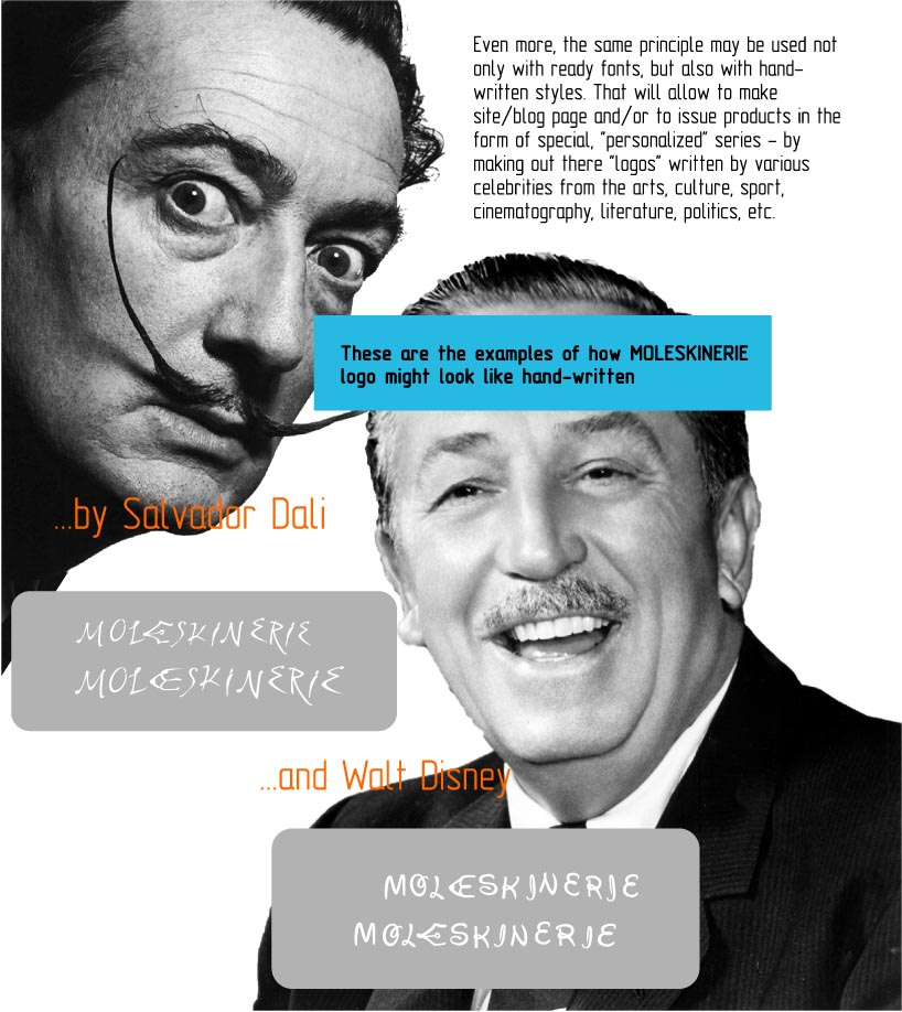
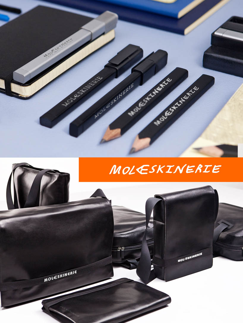
even more, the same principle may be used not only with ready fonts, but also with hand-written styles. that will allow to make site/blog page аnd/or to issue products in the form of special, "personalized" series - by making out there "logos" written by various celebrities from the arts, culture, sport, cinematography, literature, politics, etc.
blog
 description
 celebritys
 goods
goods