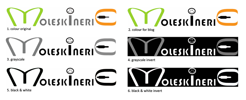
neo by aditi bisen from india
designer's own words:
the design symbolizes the relation between the writings in an open notebook and the dialogues of a blog. the alphabet ‘m’ is represented by an abstract open book/notebook graphic, while the ‘e’ in the end morphs into a computer mouse. the ‘i’ with the smiley in the middle represents the relaxed blogger who serves as a link between the moleskine product, and web log.
the colours used are a blog ‘orange’ and green which signifies paper and calm; as well as matches the new look of the molskinerie page. the logo is legible at different scales and would look good in monochrome, grayscale and multiple colours.
neo
 various tones
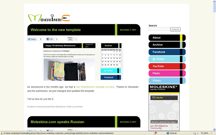
 on web page
shortlisted entries (2162)