My Moleskinerie! by purva sawant from india
designer's own words:
logo 1: the colours are inspired from the moleskine books. but it can be represented in many colours, as it has the characteristic of taking the background colour.
logo 2: here, i have tried to create a dynamic identity which can change its colour from time to time. with every new colour launched for moleskine products, one can include that colour in the identity.
logo 3: the orientation of this symbol is tilted to shoe the differentiation from the rest. "its not just a square but a diamond". also the inside form forms a 'm' which stands for moleskinerie.
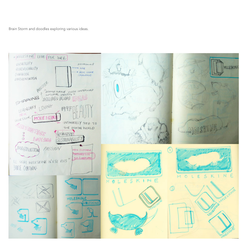
Doodle all the way.
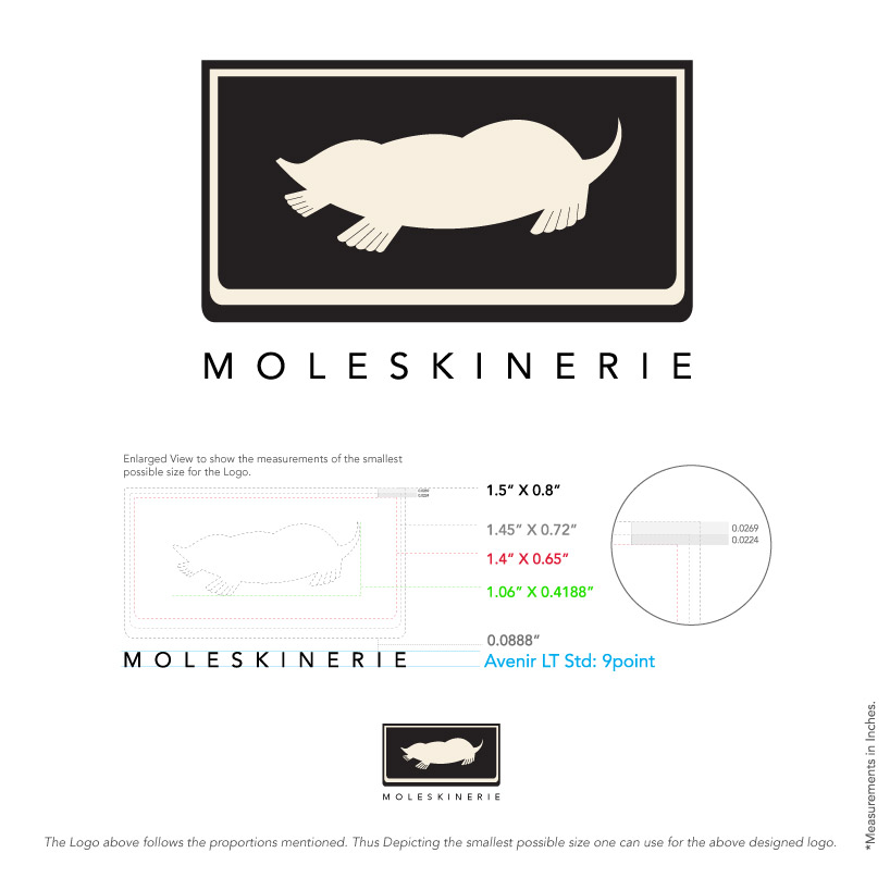 Logo 1
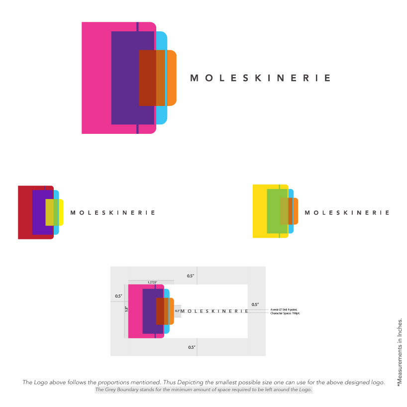 Logo 2
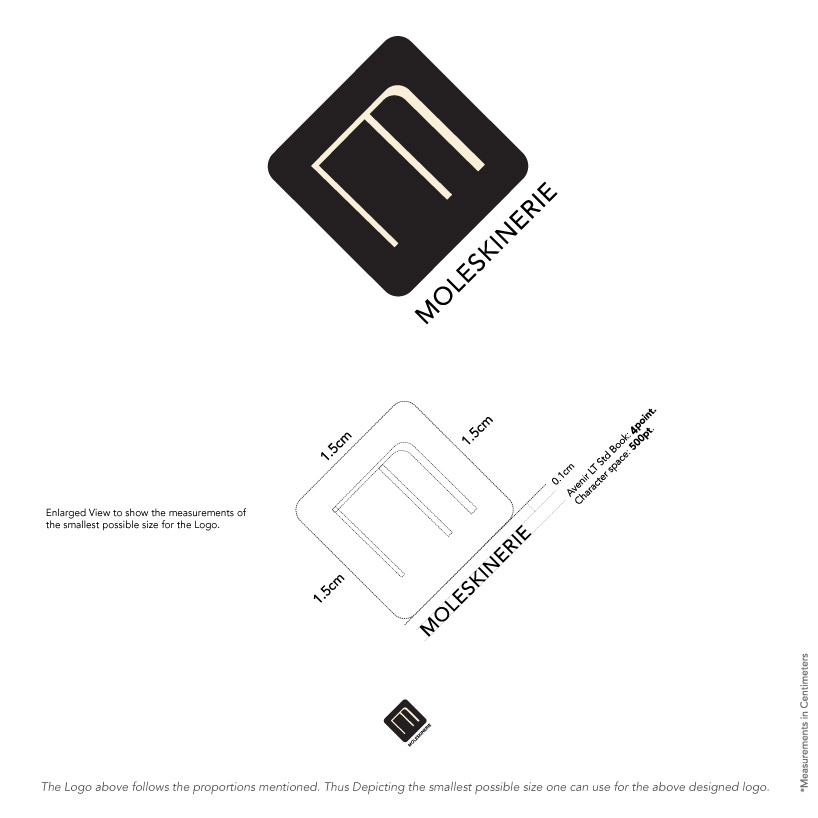 Logo 3
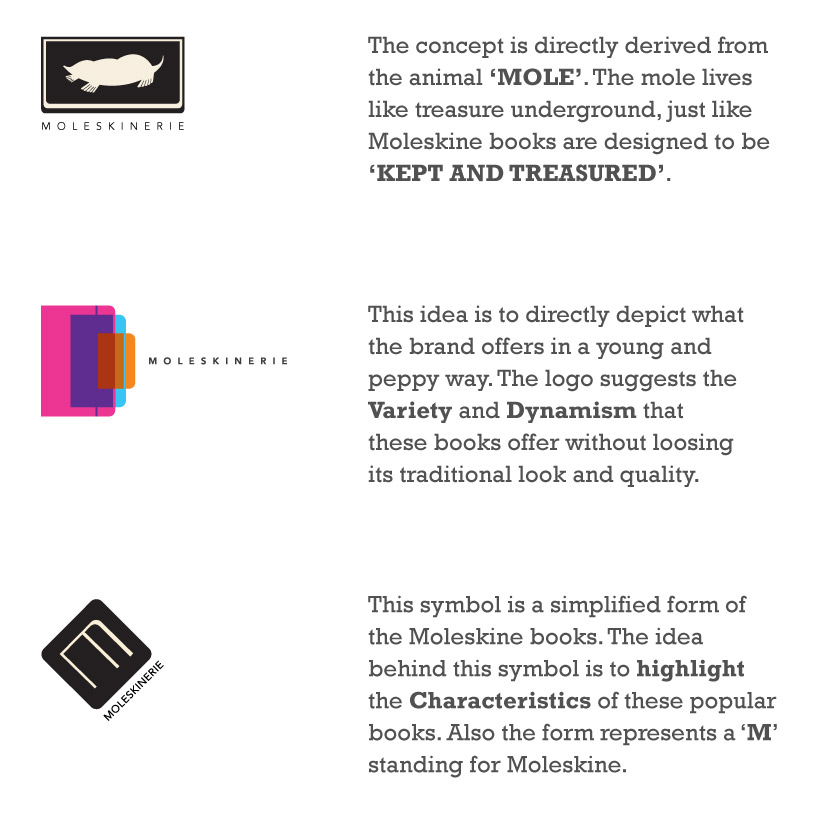 The Reason Behind
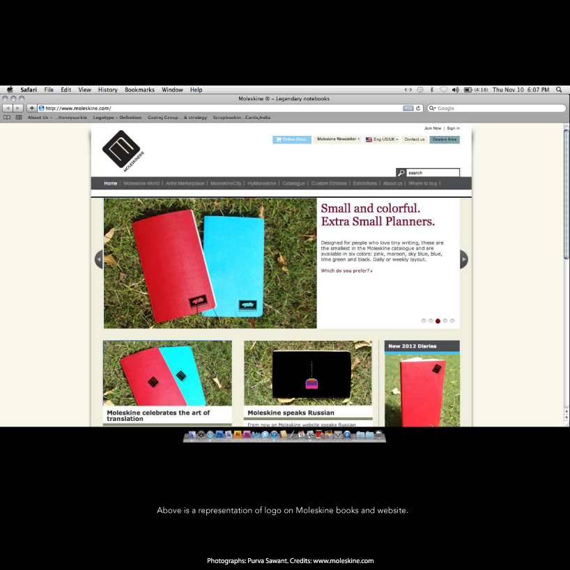 How will it look?
shortlisted entries (2162)