my computer corner by andrej marjanovic from macedonia
designer's own words:
problem:
1. too much room space wasted on a computer desk.
2. those old-school desks don't really go with nu-tech.
3. why is the corner space always wasted or avoided?
solution:
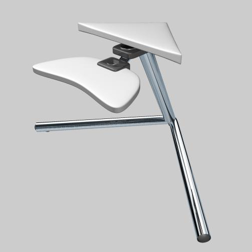
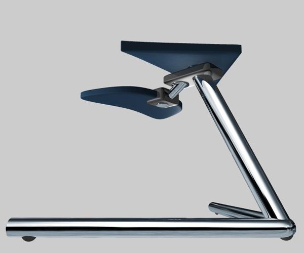
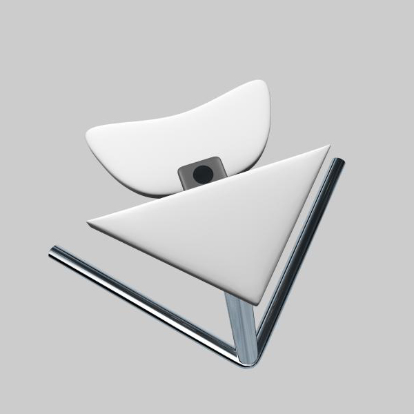
1. minimized desk space used only for monitor a keyboard and mouse. they are supposed to rotate, and free even more space when not in use.
2. the shape appears light, even if heavy materials are to be used. there can be different color patterns, depending on the user (army-like camouflage patterns with black pipes, or flower pattern with pink pipes, etc.)
3. this arrow-like design could fit nicely in the corner, and could be easily moved arround (has wheels underneath).
normal view
 view from the side (back)
 top view
shortlisted entries (1071)