MWings by veronica de salvo from italy
designer's own words:
a good logo has to be as simple and recognisable as possible. that’s why i decided to reproduce the image of a moleskine to create a logo for moleskinerie. moleskine has become a symbol recognisable by everyone, so it is a perfect logo itself. i worked on its shape and position, and finally decided to form a sort of “m” with the images of two open moleskines. This “m” has also a deeper meaning: it represents two wings, the wings of creativity, and if creativity can fly high, it’s because there is a moleskine ready to receive it in form of drawings, ideas, poems, and so on.
B&W Logo
![]() B&W Logo sizes
B&W Logo sizes
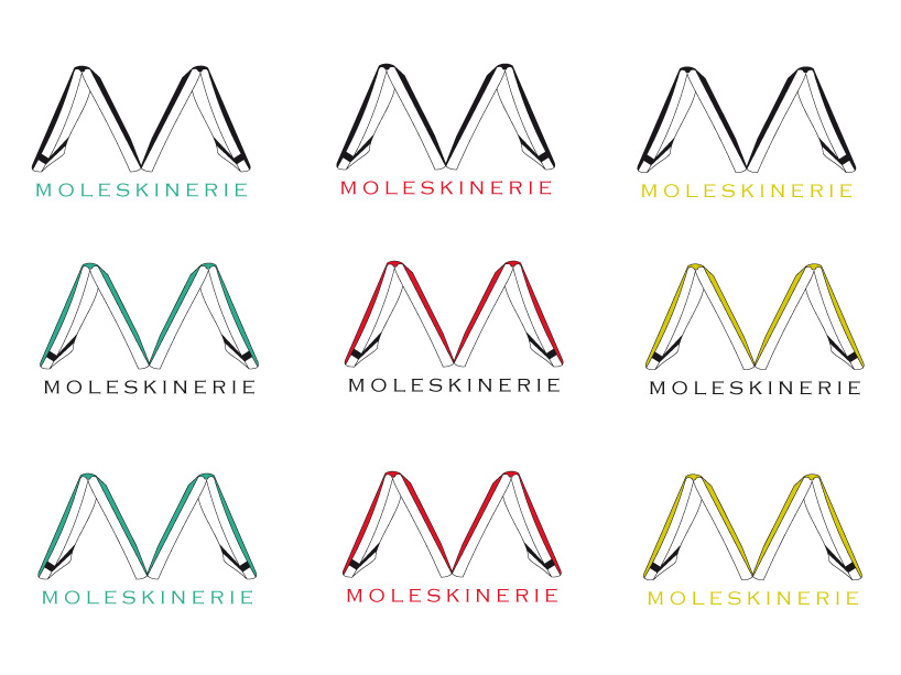 Coloured versions
shortlisted entries (2162)