mr.m by nicolas barreau from france
designer's own words:
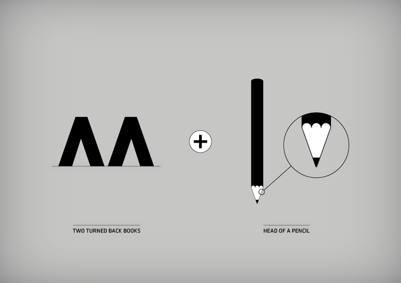
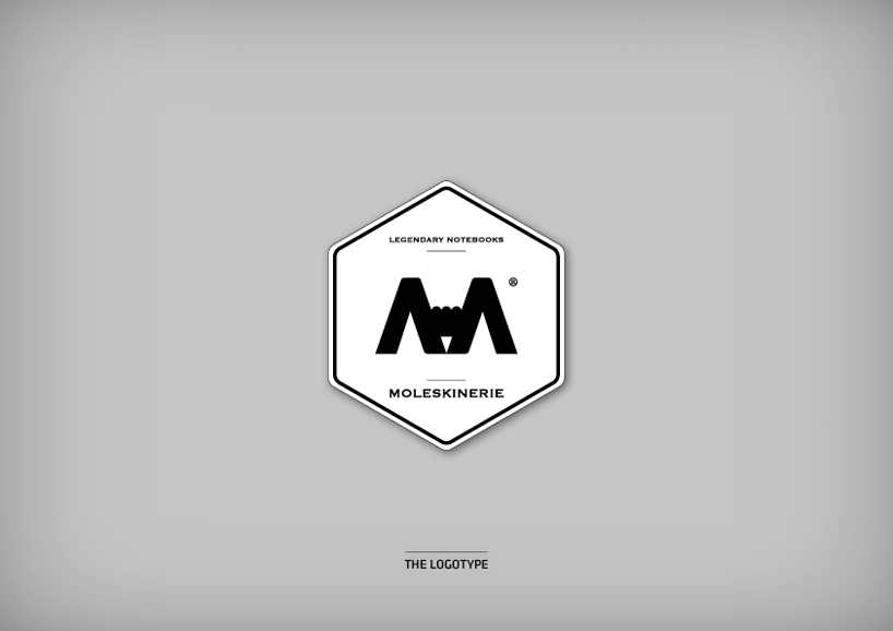
the simplicity of the logotype combines two turned back books and the head of a pencil. he looks like a stamp to magnify the legend.
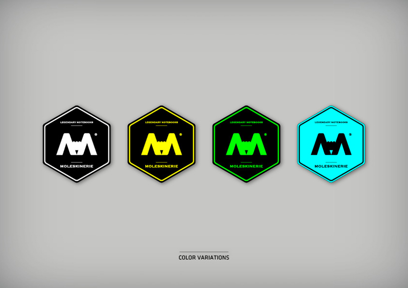
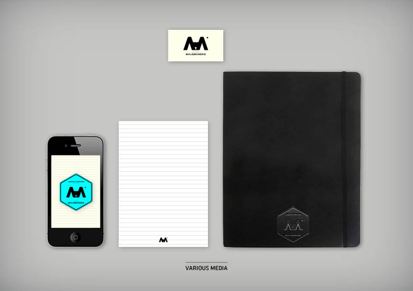
it could be declined in several colors variations regarding to the different notebooks sizes. the logotype ''mr.m'' should also be applied to the others medias, iphone application, business card...
nbarreau1
 nbarreau2
 nbarreau3
 nbarreau4
 nbarreau5
 nbarreau6
shortlisted entries (2162)