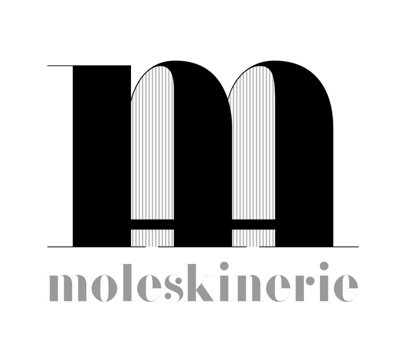
moleskinself by ana criado zahonero from spain
designer's own words:
this logo is quite conceptual. the "m" contains two moleskine. easy and effective. elegant and conceptual, two ingredients that i considered elementals for the creation of a logo for the legandary moleskine. i thought in a typography that lives well with the traditional logo of moleskine, and respect the clasicism of his look and history. i hope that all of this you look in my logo.
shortlisted entries (2162)