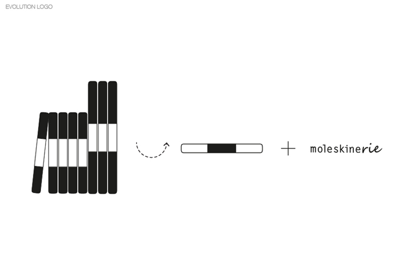
moleskinerie's spine by Leidy Ossa Noreña from colombia
designer's own words:
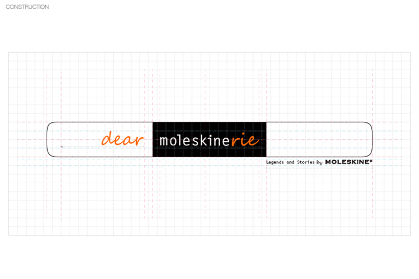
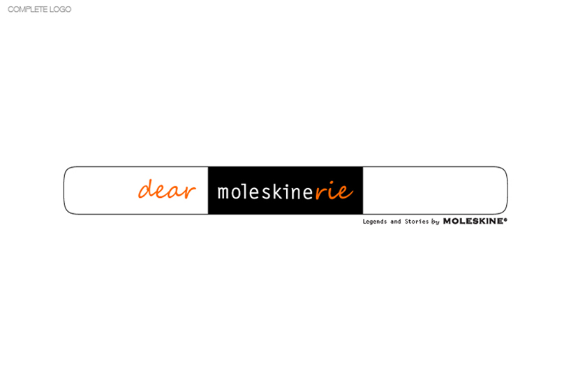
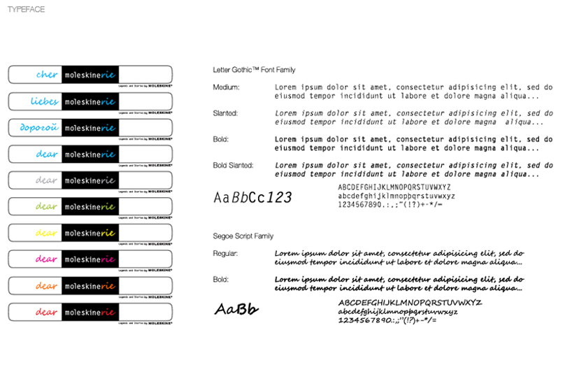
MOLESKINERIE is a simple logo based in the classic moleskine tipography and in the basic lines of a moleskine's spine. The variations in the logo use the traditional colors of the trade and it suggest too different forms to say hello before to begin to write in the blog depending the idiom -dear, cher, liebes-.
Additionaly we propouse a short logo. It can be used to print versions, web links and publicity.

shortlisted entries (2162)