Moleskinerie's Personal Signature by dan ostafi from romania
designer's own words:
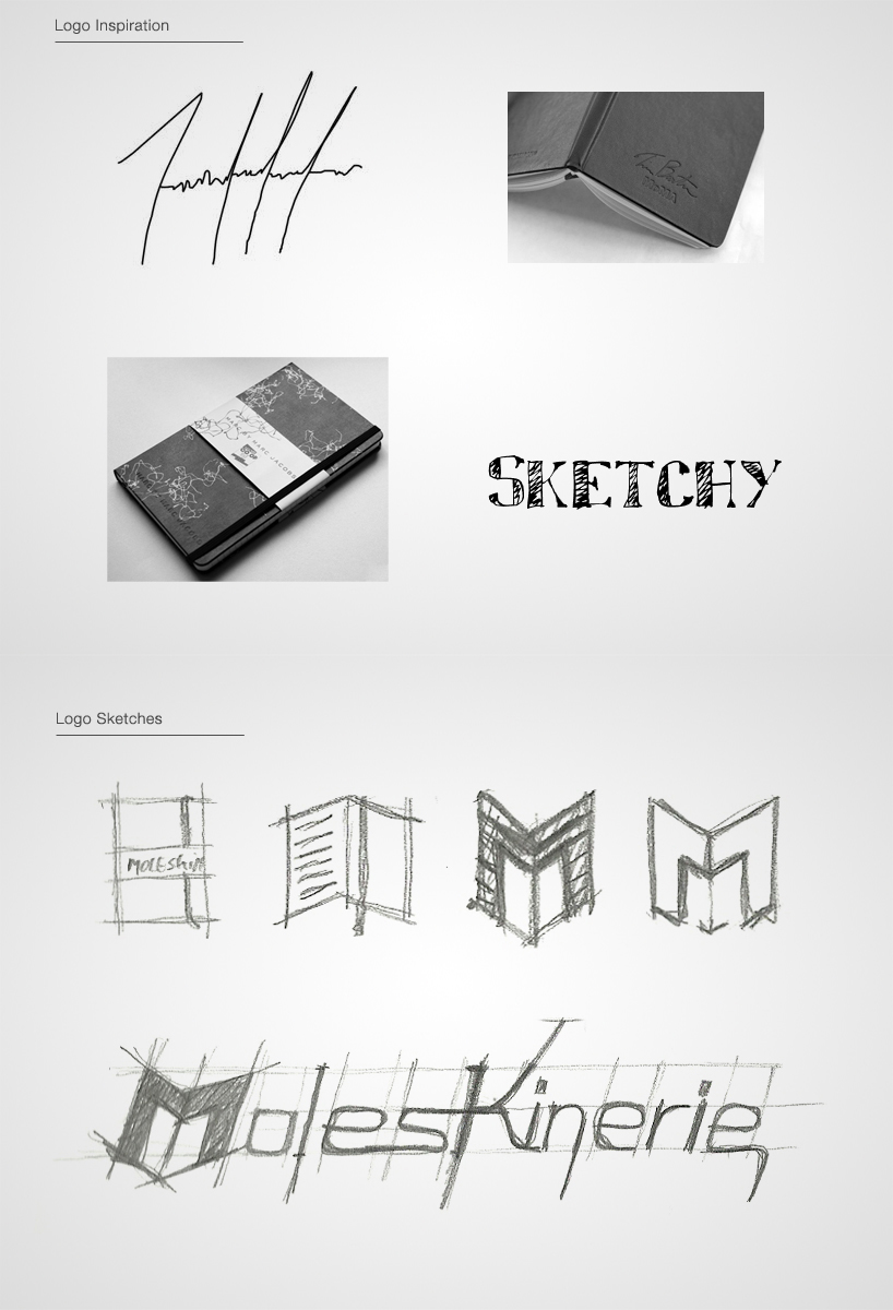
what happens when you run out of ideas? you start staring at the notebook, or maybe the walls , or the cute animal next to you, but eventually you start doodling your signature and lots of other shapes, lines and other stuff. but why do we start messing around with our signature, why do we start repeating it on paper until ideas start popping around in our head?
the signature is our distinctive “logo” that makes us unique! as an artist we get recognized by our signature. it’s that catchy visual “doodle” that looks different for each and every one of us.
a moleskine notebook is the artist’s first step towards the final artwork. it’s their own idea canvas where you start throwing in ideas, sketches, timelines, information.
moleskinerie blog should be moleskine’s signature, their own personal canvas where they spred new ideas, therefore the logo must be their own signature!
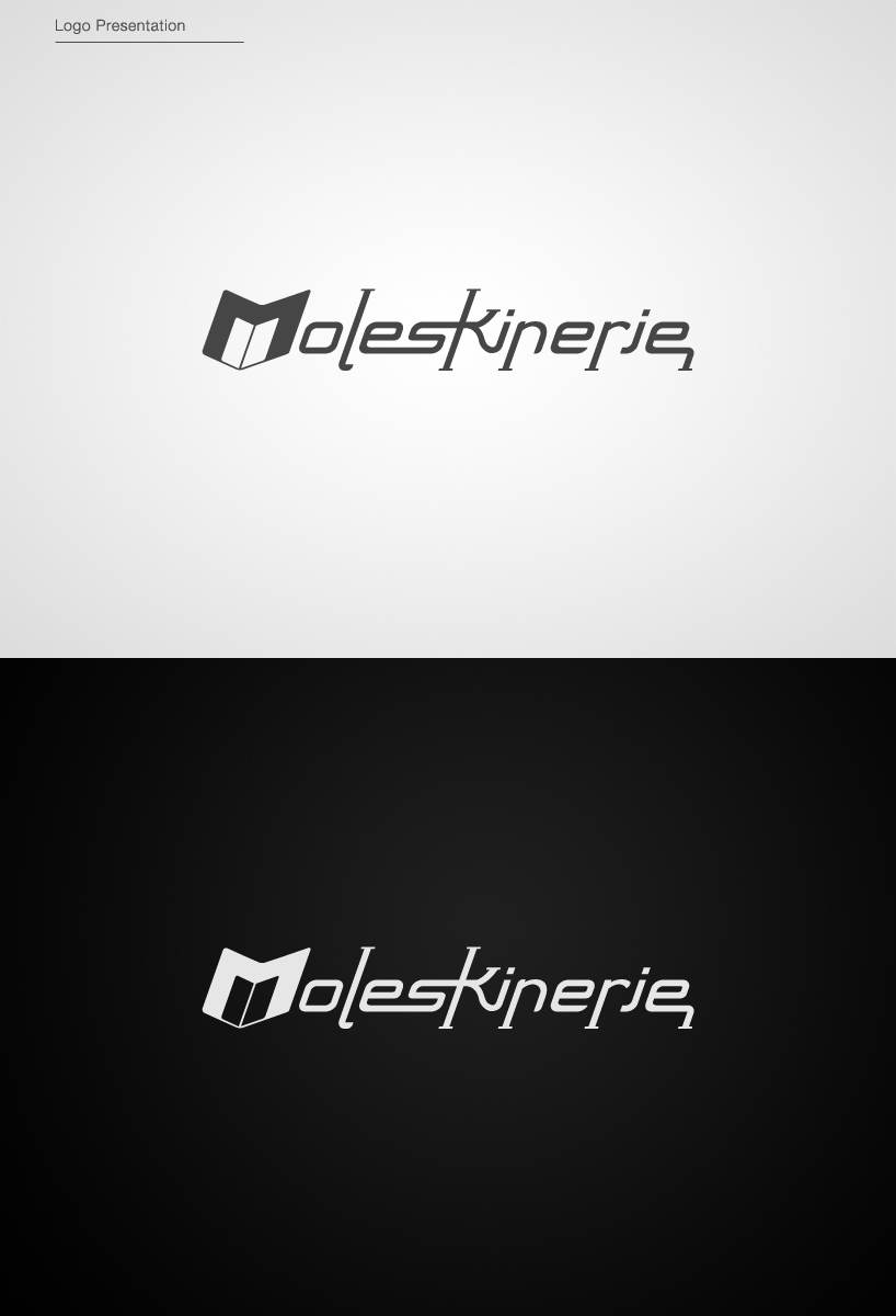
my approach of the moleskinerie logo is the visual transformation of the blog in a personal contemporary signature that stands out! a signature that makes the blog a internautic workspace where the people can interact, share ideas, and socialize.
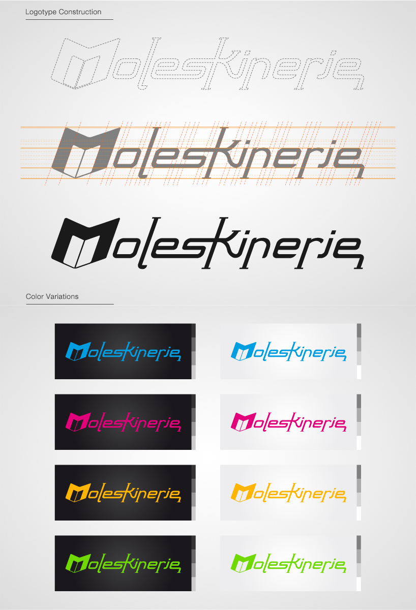
also the “m” letter of the logo has incorporated in it an moleskine notebook in the negative space to guide the “untrained eye” to the idea of moleskinerie being a notebook related blog. the color variations consist of the primary colors, the first 3 colors are slightly variations of the basic cmyk palette, that is a milestone in the paper industry.
///logo concept:
sketches -> ideas & concepts -> artwork -> artist -> signature
signature -> moleskine -> moleskinerie blog -> canvas of ideas
Logo Inspiration
 Logo Presentation
 Logo Construction
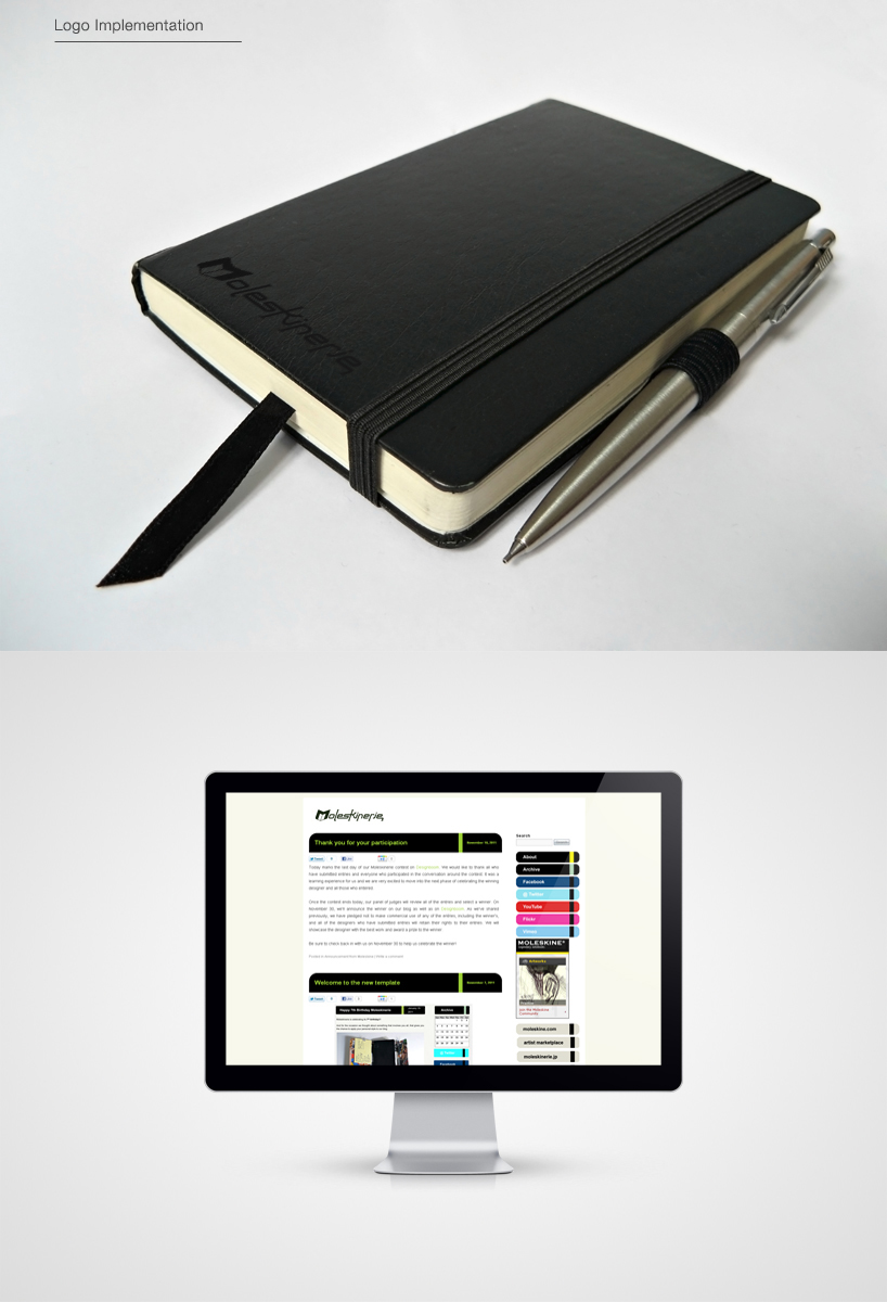
 Logo Implementation