Moleskinerie with passion by marina francisco from portugal
designer's own words:
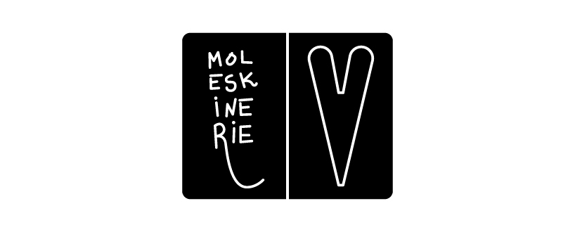
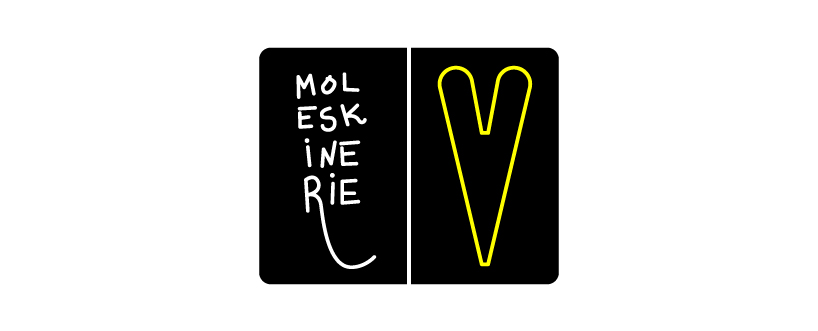
My proposal for the logo of the brand Moleskine’s blog, “Moleskinerie” is based on the most iconic image of the brand - the notebook. Therefore, I’ve designed the notebook in an open format, the format in which you can write, draw, format in which we can let our imagination flow. The open notebook takes the form of two rectangles separated by a centered vertical line (bookmark strip). To the rectangles I’ve added the name of the blog (Moleskinerie) handwritten making reference to the function of the notebook – write and draw – and a pictogram – a heart – because those who really like the brand, also have a strong passion for writing and drawing on those leaves.
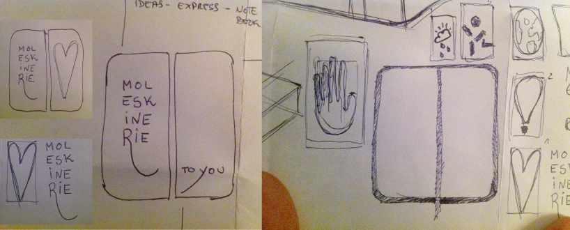
process
 black and white logo
 color logo
shortlisted entries (2162)