moleskinerie trimmed by Josmar Azzopardi from malta
designer's own words:
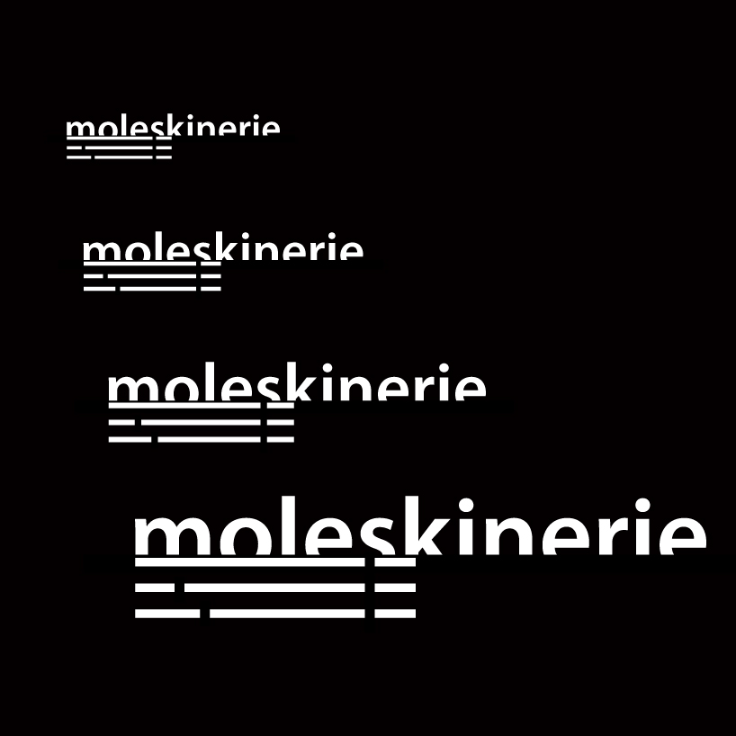
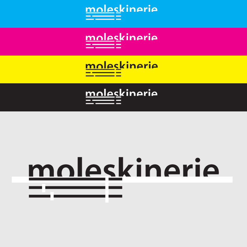
the logo consists of a text-based logo overlying a graphic symbol too.
the text is quite clean with a trimmed feature at the bottom part.
the symbol represents a stylised moleskine notebook highlighting the classical features;
the ribbon bookmark [left feature] and the elastic band [right feature].
black vs white
 white vs black
 sizes
sizes
 cmyk
cmyk
shortlisted entries (2162)