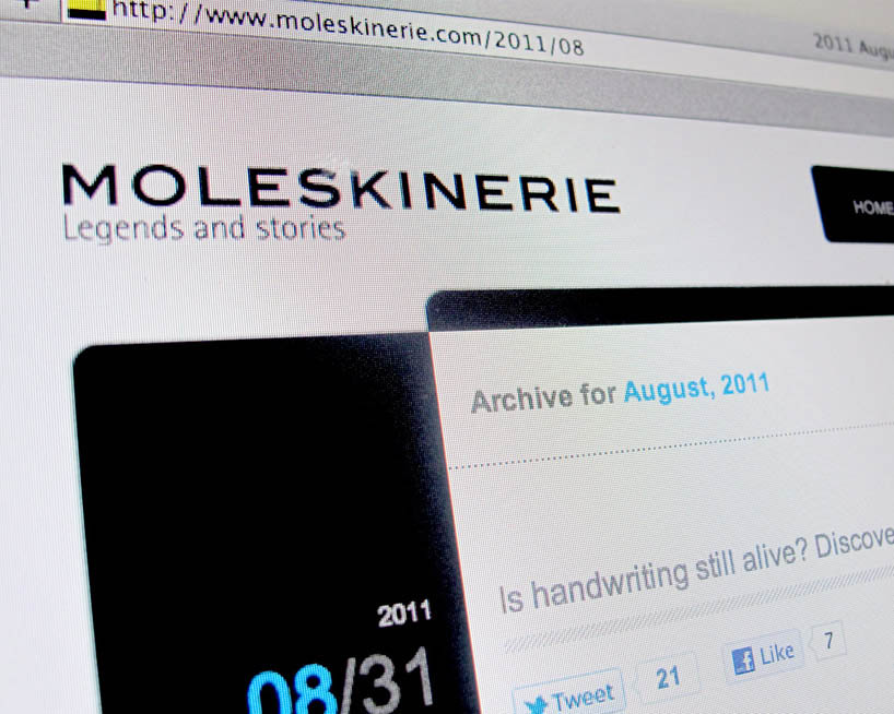
moleskine(rie) today by Predrag Nenkovic from serbia
designer's own words:
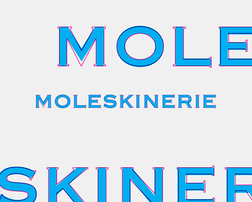
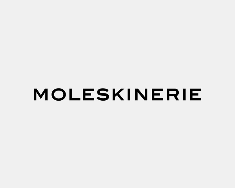
staying devout to traditional recognizable identity logotype is up to date variation of existing one. leaning toward the simplicity, original logotype just lost serifs and went true gentle shape makeover.
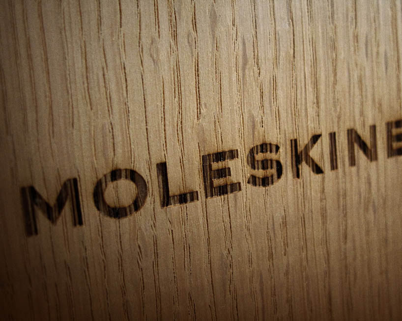
it is best used as a combination of tradition and modernity, creating beautiful paradox. for an example a new logotype laser engraved in wood.

shortlisted entries (2162)