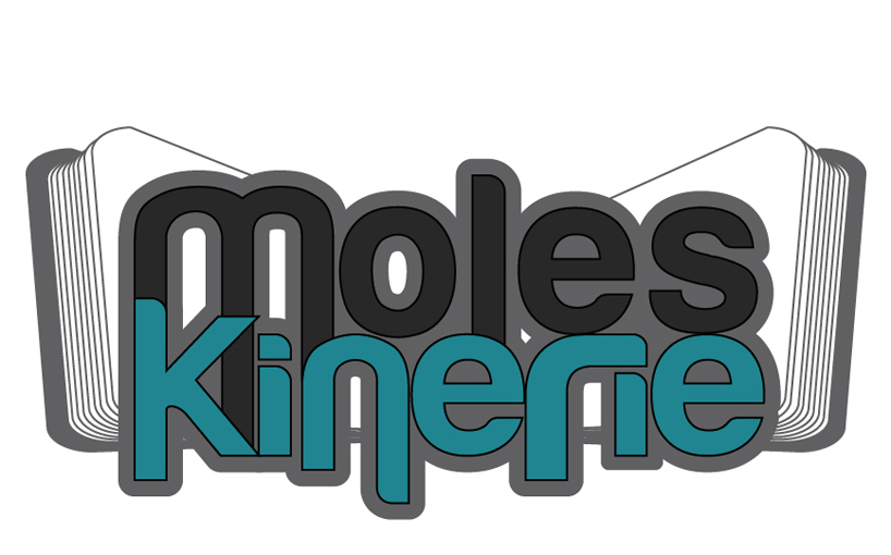
Moleskinerie the open book logo by miguel diogo gomes from portugal
designer's own words:
by reading the briefing of this competition, i thought it would be good, as a starting point, to use the well-known and iconic moleskine notebook for the creation of this logo. as such, i chose to represent the notebook open with the company name displayed in the center. in this sense, i want to convey the idea that a note made in this book can become something more, from an idea to something concrete.
i created a readable and creative logo through simple lines and contrasts that highlight the company name. when it came to the colors, i took into account the company's target audience (mostly artists) and the company itself, i chose blue, black, gray and white. blue represents youth, truth, wisdom and confidence. black expresses elegance and stability. the gray represents security and maturity. finally, the color of perfection, the white, which represents purity.
the original version of the logo
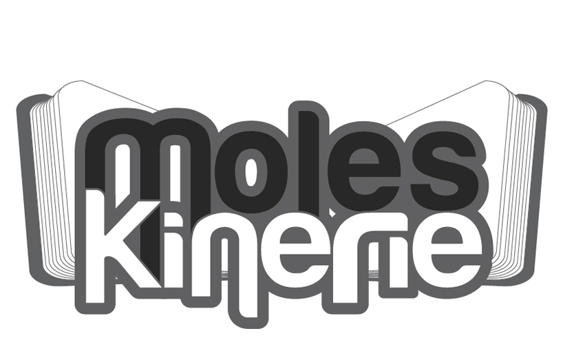 black and white version of the logo
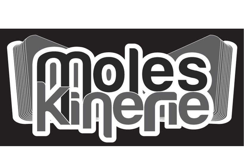 inverted black and white version of the logo
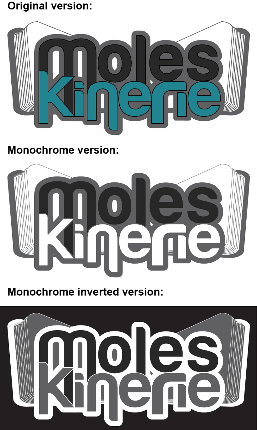 all versions of the logo