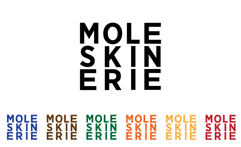
MOLESKINERIE SQUARED by kevin clancy kclancy from usa
designer's own words:
i've used moleskine notebooks for years and have always admired the minimal branding and simplicity of their products. i created a logo that i believed kept that same approach. i broke down the name moleskinerie into three rows creating a logo you can say out loud while looking at it. the rectangular shape represents the notebooks.

shortlisted entries (2162)