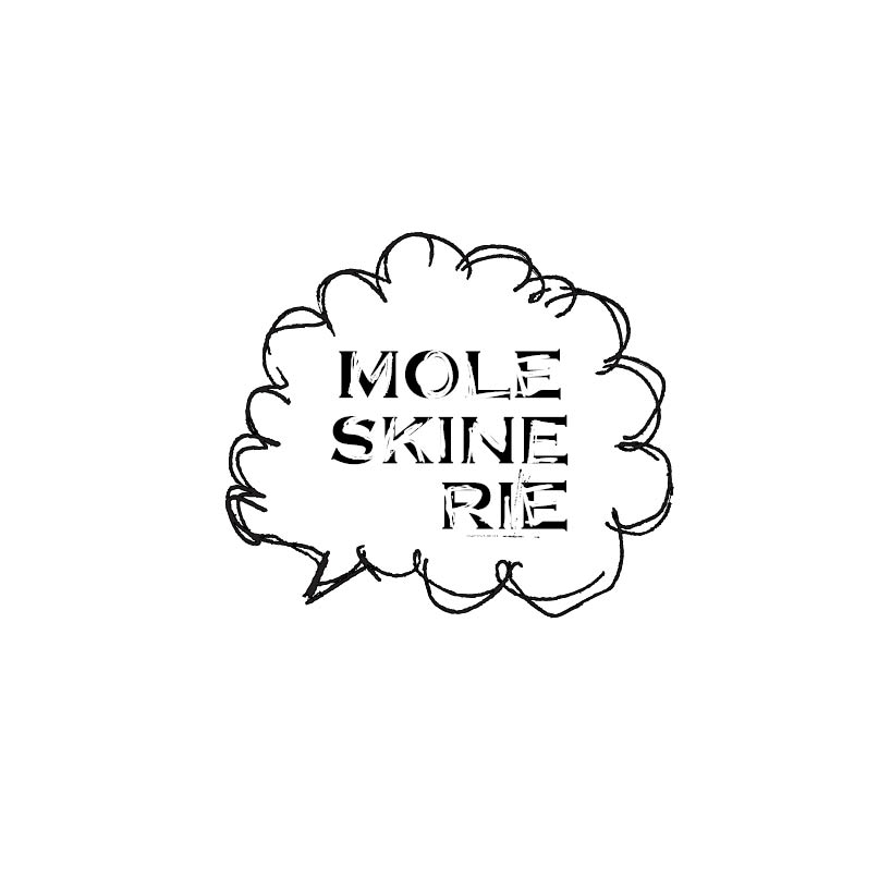
Moleskinerie Sketch by claudia ferreira from portugal
designer's own words:
like i said before, my logo idea is based on the true sketches we do on moleskine produtcs. i choose to use the original typeface used on moleskine original logo and scratch on it, like we are actually sketching on moleskine.
Logo
 Positive/Negative
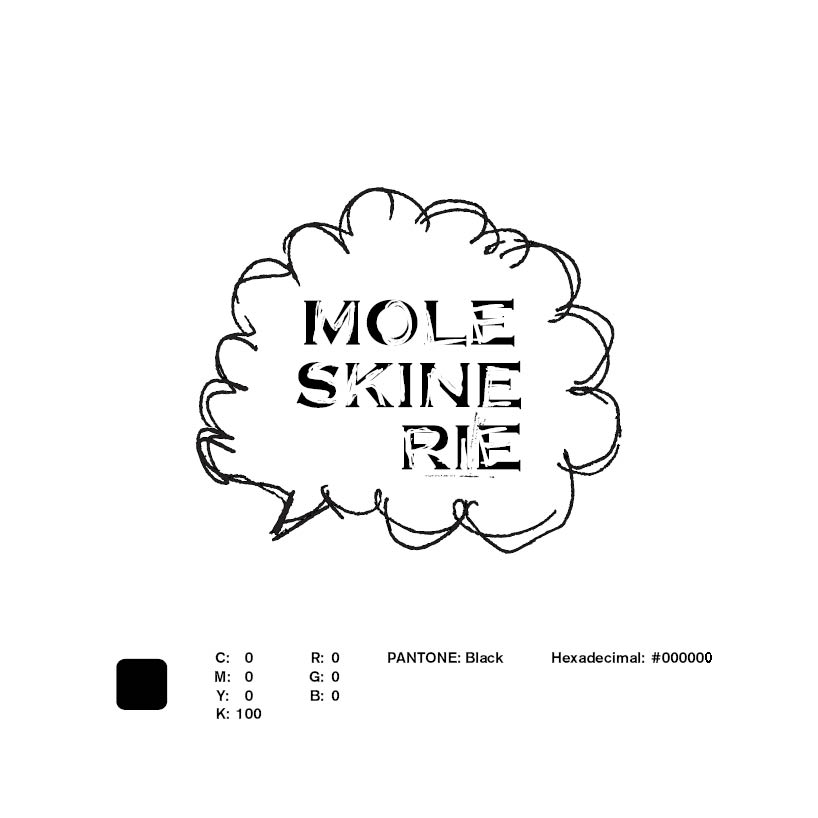 Color Values
 Mininum Size
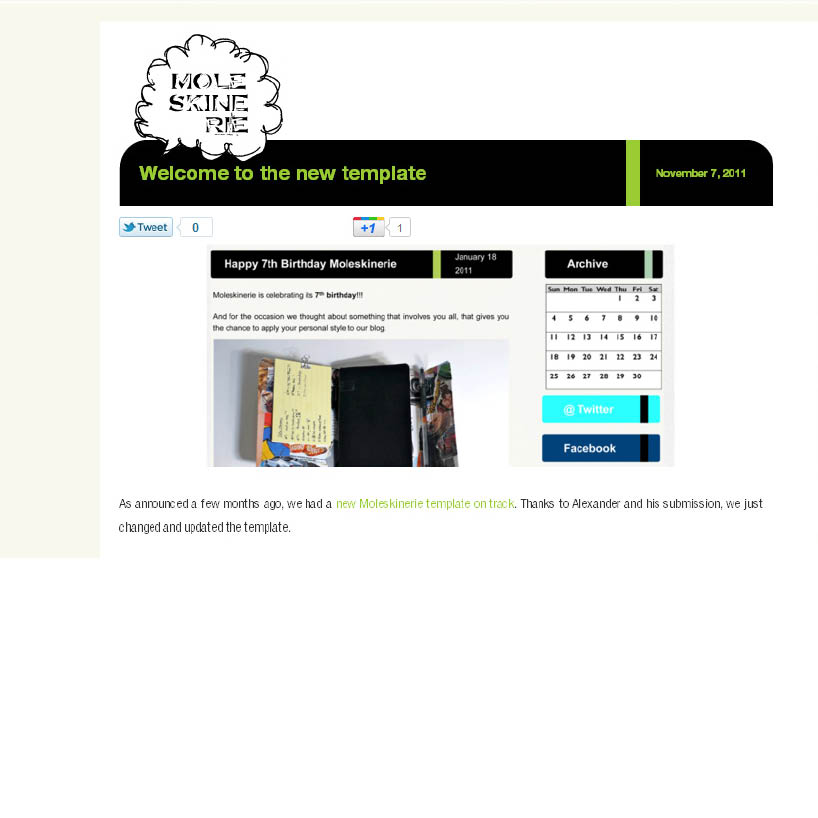 Simulation on the blog
shortlisted entries (2162)