Moleskinerie Simplicity and Design by niccolo galimberti from italy
designer's own words:
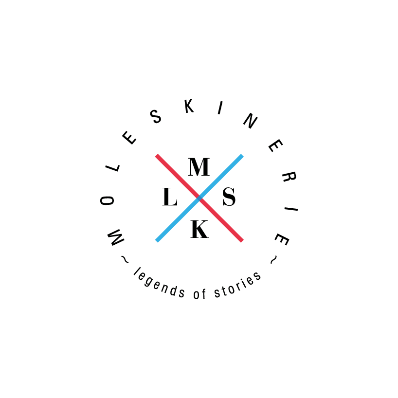
I designed this logo after studying the history of Moleskine. I believe that Moleskine and Moleskinerie are part of the same philosophy; the difference is that the first serves as a reference for marketing and information, and the second serves as a socializer element. Through this blog all Moleskine fans can express themselves and feel more involved. The logo I created is essentially part of the Moleskine philosophy. It is inspired on the oldest logos, basic but effective, easy to read and recognize. The blog name is represented in a circle; I think that the circle is an exclusive element, just think in the ancient French and British cultural circles. I thought about a lot and I arrived at the conclusion that just some people are attracted by the charm of Moleskine, and I believe these people are indirectly part of a circle. The logo hosts in the interior the letters of the word Moleskine, they are positioned in the space of a cross, a structural element that supports the entire symbol. I used two colors (except black of course) the blue that transmit security and freshness, and the red, passionate and romantic, like Moleskine and his blog.
The font used for the text is the Zurich BT Roman, that give to the logo modernity and structure. For the interior I used Bauer Bodoni BT bold, a serif font with a that transmit romanticism and it does not forget the history and origins.
Logo
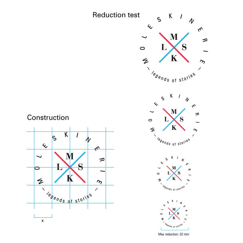 Construction Reduction
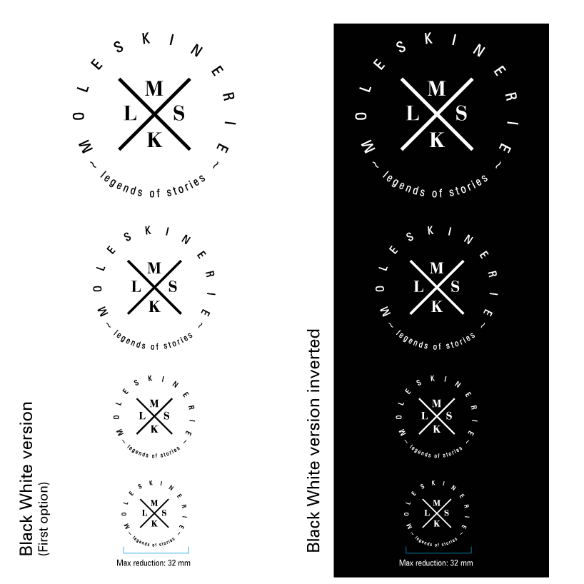 Black and White
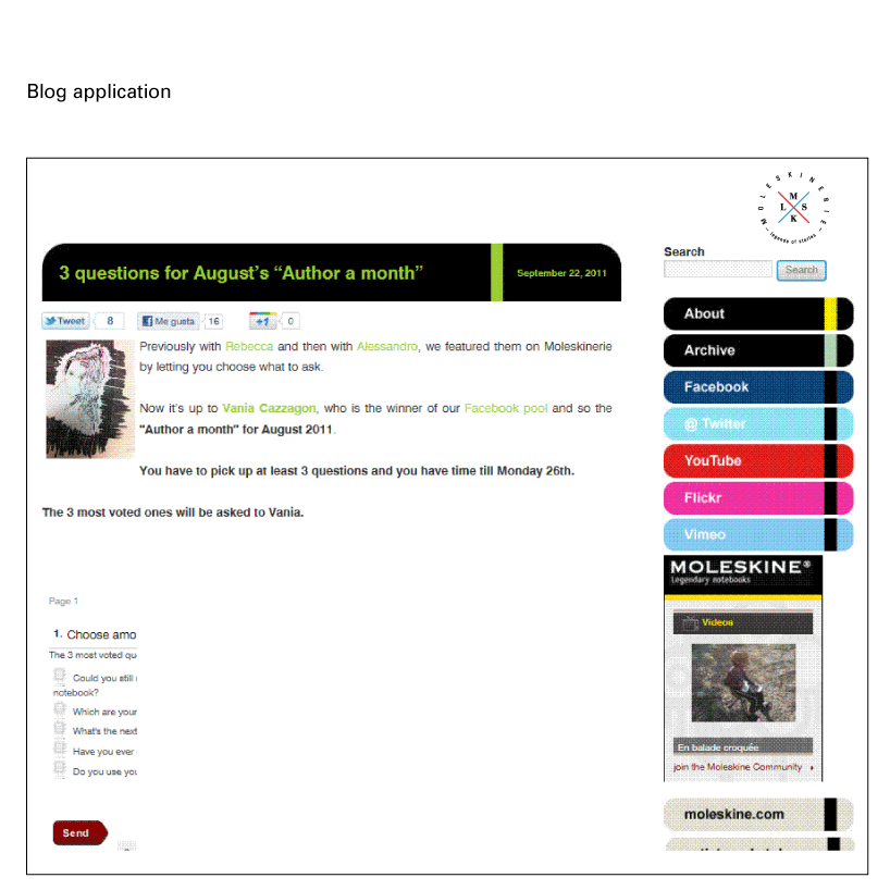 BlogApp
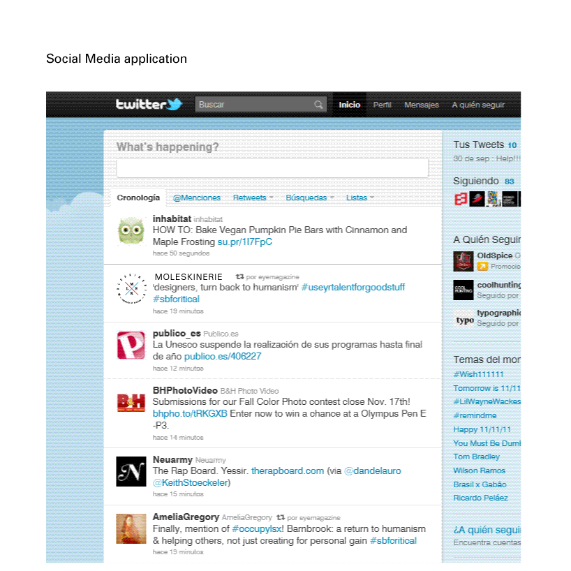 SocialMediaApp