moleskinerie side by ritienne zammit from malta
designer's own words:
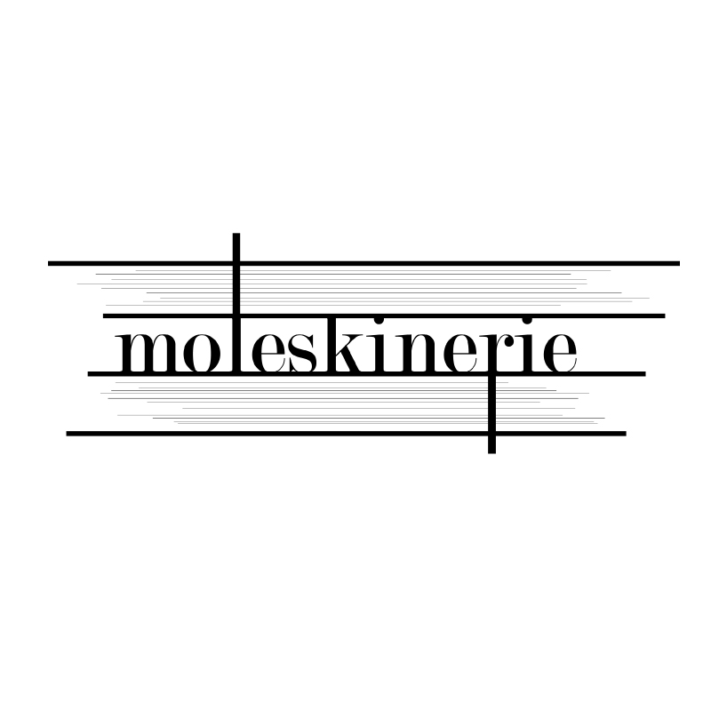
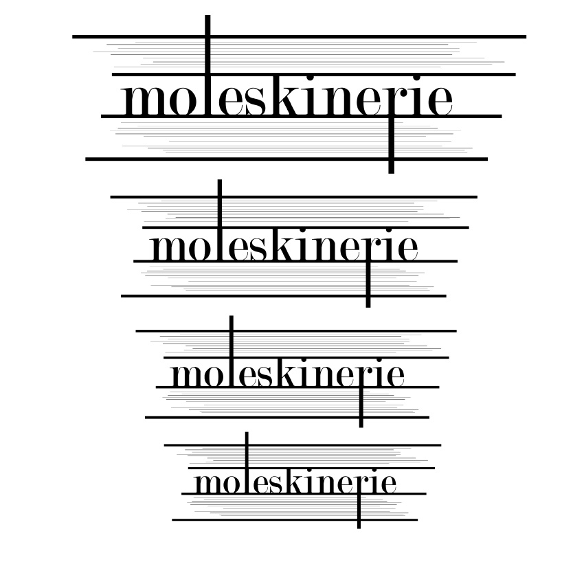
the idea for this logo was inspired from the side view of the moleskine notebook. for the font i decided to go for something which is elegant, classy with a modern element. the elongated element presented on the letter l and r are representing the elastic bands.
the main logo
 different logo sizes
 logo white on black
shortlisted entries (2162)