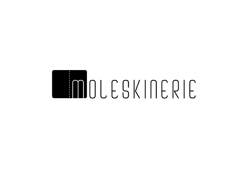
moleskinerie: seeing things from the start by luisa henke from brazil
designer's own words:
In developing this logo, my foremost intention was to stress the features of lightness and elegance, as well as to develop the concept of a “beginning”, as many things start with a Moleskine: an idea, a work of art, a product, a story or an expression of feelings. To valorize this concept, I silhouetted the inicial letter “M” on the notebook page, representing the project of something. The rest of the word can be understood as the fulfillment of that idea which was originated in a Moleskine.
The creation of the typography was based on a rectangle with rounded corners. The light and wide letter spacing makes for easy reading. For the logo’s notebook representation, I emphasized the binding of one of my favorite Moleskine models, the Cahier.
shortlisted entries (2162)