moleskinerie revisited by vladimir trajanovski from macedonia
designer's own words:
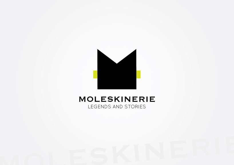
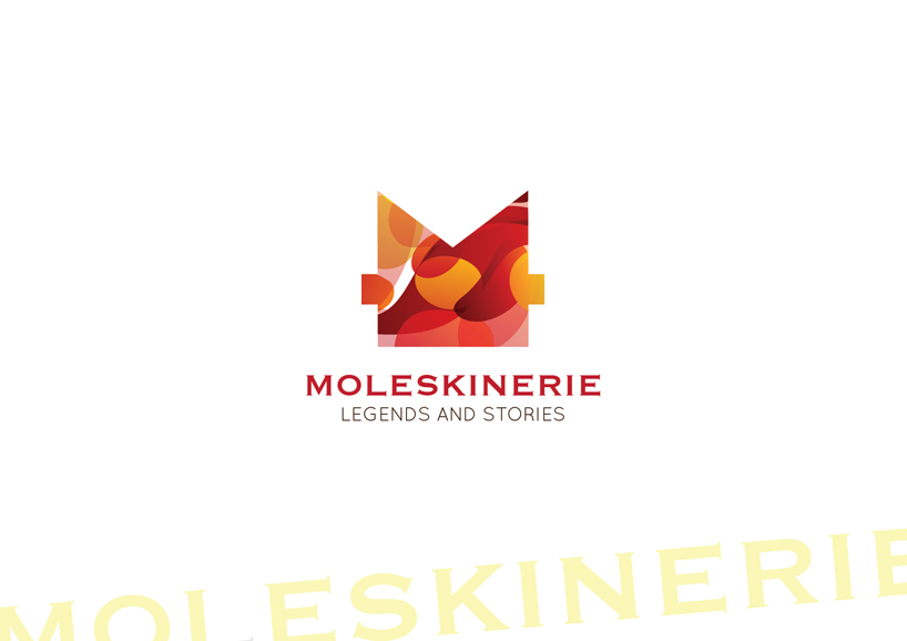
the idea was to make a very simple visual symbol for the moleskinerie website. basically the logo is made from two squares intersecting to make the letter m, black, resembling the moleskine book, and one light green stripe is put in the back. the stylized letter m is visible even when downsized. the file 2 is a revisited version of the first entry, with the letter m and the stripe made as a color portal, a key hole for the wonderful and extraordinary possibilities that moleskine gives to the buyers. the world of moleskine is happy and creative, and the blog is a portal for gathering all the visual experiences from the world.
shortlisted entries (2162)