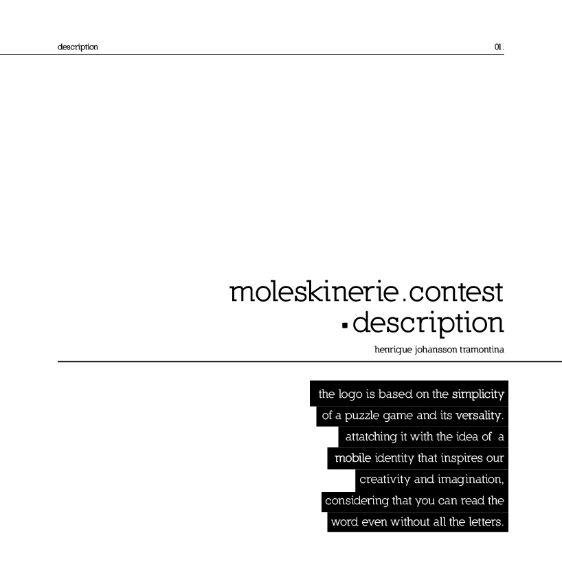
moleskinerie puzzle by henrique johansson tramontina from brazil
designer's own words:
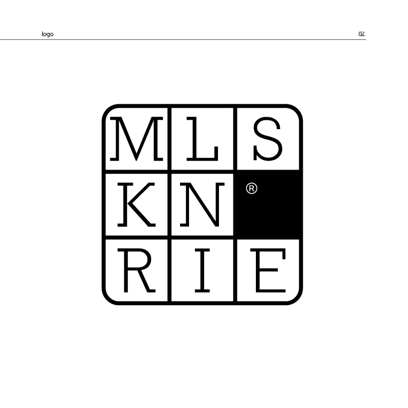
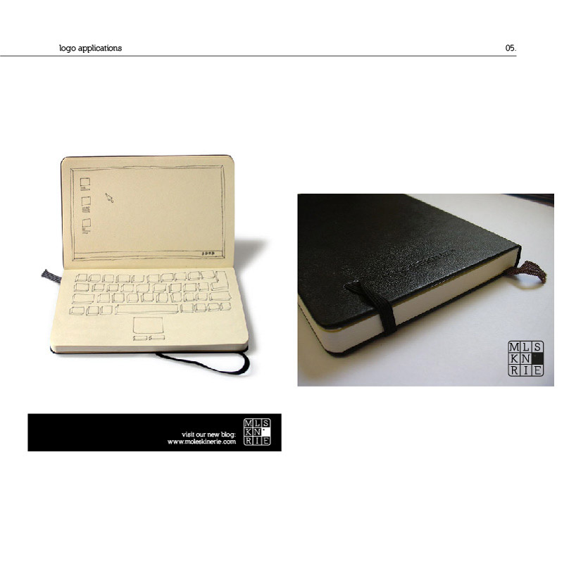
designed from the nomadic principal of moleskine products, the logo is based on the simplicity of a puzzle game and its versatility, attatching it with the idea of a mobile identity that inspires our creativity and imagination.
the truth is that the brand name is so known in the hole world that the logo is readable even with some missing letters. the idea of that is: let's try to explain to people that they are able to be creative and use their imagination even with the basics. and moleskine are quite representative to this thinking line, 'cause their products are modern and simple at the same time, but people can get the message.
the logo is balance between letters and spaces, easy to get!
description
 logo
logo
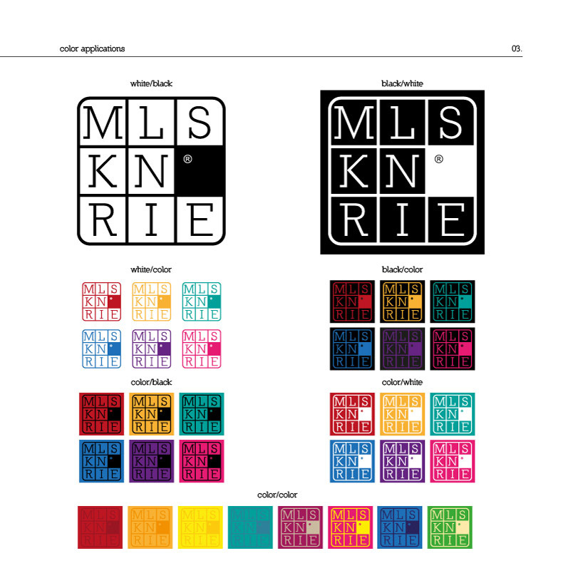 logo colors
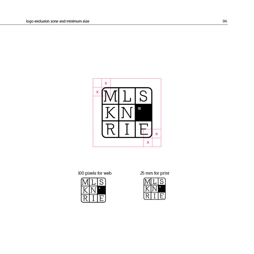 logo exclusion zone and minimum size
 logo applications