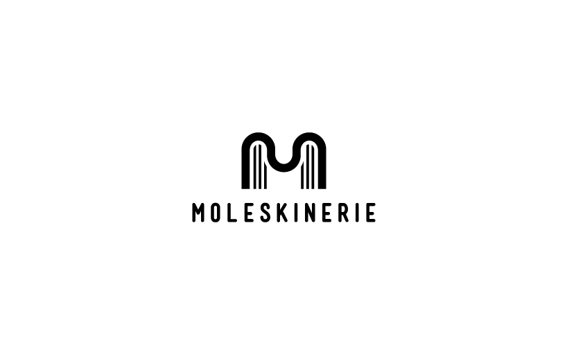
moleskinerie M by jovan petric from serbia
designer's own words:
my solution is a stylized letter m. inside m we have six pages, or three on each side. it is quite clear why the letter m is used (moleskinerie), and pages that represent a well-known moleskine products. mark was made after a series of experiments with different shapes and forms. mark is easy to use and can be easily transformed in any available color. logo because of its shape and structure can be easily used to the web and in print.
Logo
 Logo negative
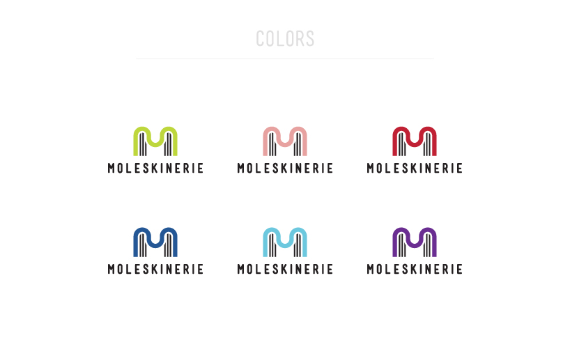 Colors 1
 Construction and dimension
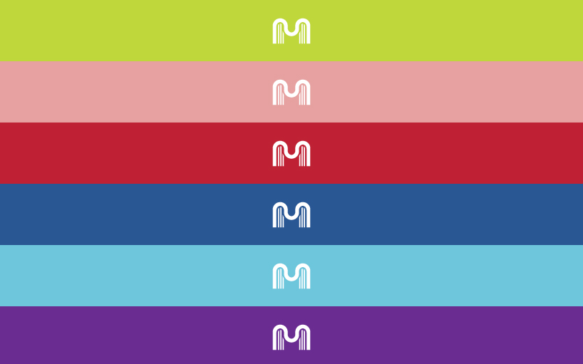 Colors 2
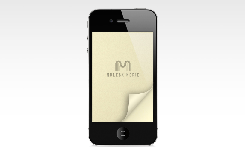 iPhone mock up
shortlisted entries (2162)