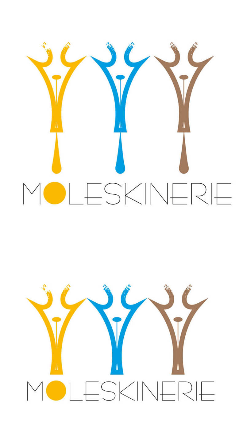
Moleskinerie logotype submission by Arbedesign: by jiri arbe minovsky from czech republic
designer's own words:
the usage of the nib of the pen (as the most typical and traditional
tool used by the moleskine customers) symbolizes and honors the
tradition of hand-written content of the notebooks,
also can stand alone as the symbol of creativity, or as in the first
variation, the three pens as forming the letter M) the range and usage
of the colors goes with the natural style
(in the moleskine products people still use their own hand to create,
in juxtaposition to almost all other digital creative platforms).
so the symbol generaly celebrates and honors the true force behind
all moleskine products, which is the creativity of their users.
moleskinerie v1
 moleskinerie v1
shortlisted entries (2162)