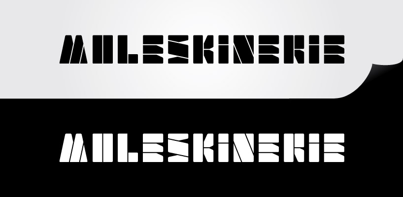
moleskinerie logotype by fábio santos from portugal
designer's own words:
This design is inspired in the black rectangular shapes and the straps of the moleskin products. The lettring construction is based on the formal image of the products, where the white lines stand for the straps that hold close the books sketchbooks. Being, the logo, for a blog, i find an only lettering image stronger, therefore the absence of a symbol in the composition.
logolettering
shortlisted entries (2162)