Moleskinerie logotype by natasa skrbic from serbia
designer's own words:
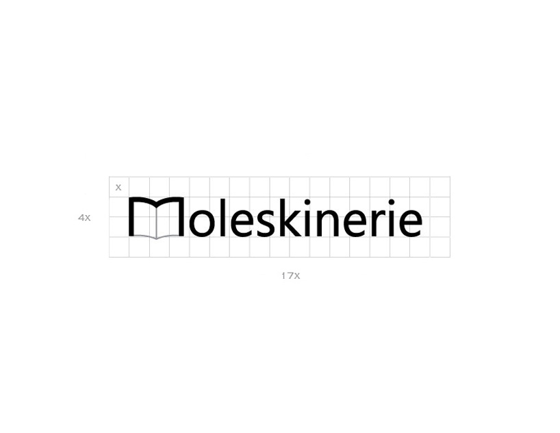
the idea how moleskinerie logotype should look like was that it must be simple, minimalistic, appealing and the first of all to tell about moleskine brand.
the “m” letter is stylized into a opet notebook, and the rest of a word is in very simple
sans serif font (segoe ui).
the whole logotype is in black and very little part of a gray color.
i chose a black color because it is a symbol for elegance, sophistication and gray simbolyzes practical, timeless and solid, just like moleskine products.
Logotype
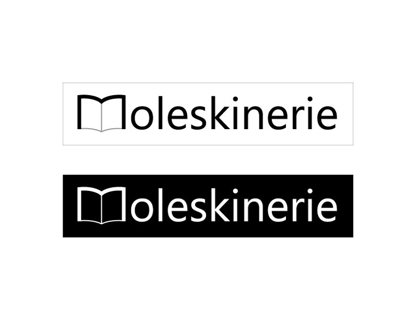 Logotype positive negative
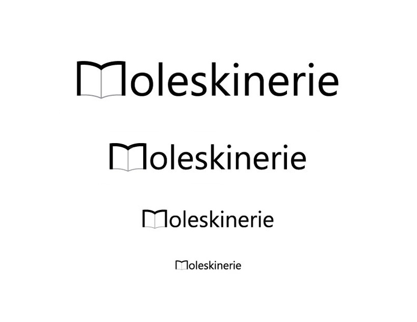 Logotype downsizing
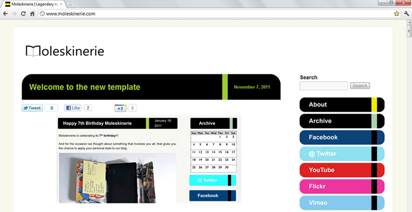 Blog- web example
shortlisted entries (2162)