MOLESKINERIE LOGO3_Sameer by sameer jena from india
designer's own words:
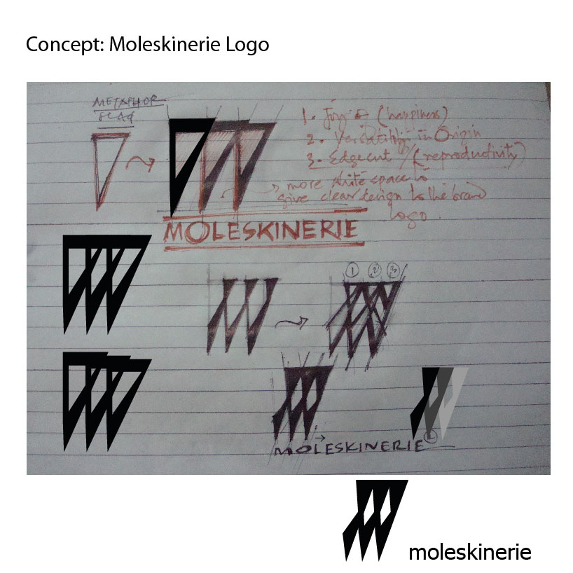
The logo has some criss cross line intersects each other to make "m"; the icon or "moleskinerie" and also the three lines altogether represents flag.
The flag denotes victory and joy for life.
design methodology:
here the design has complex form, but has some internal meanings to the product.
monocromatic approach may works,but for print I used one color and is black.
It will give the product and all product lines(accessories) an unique identity i.e bold and smart visual identity.
Conceptual Sketch
 Final Logo
shortlisted entries (2162)