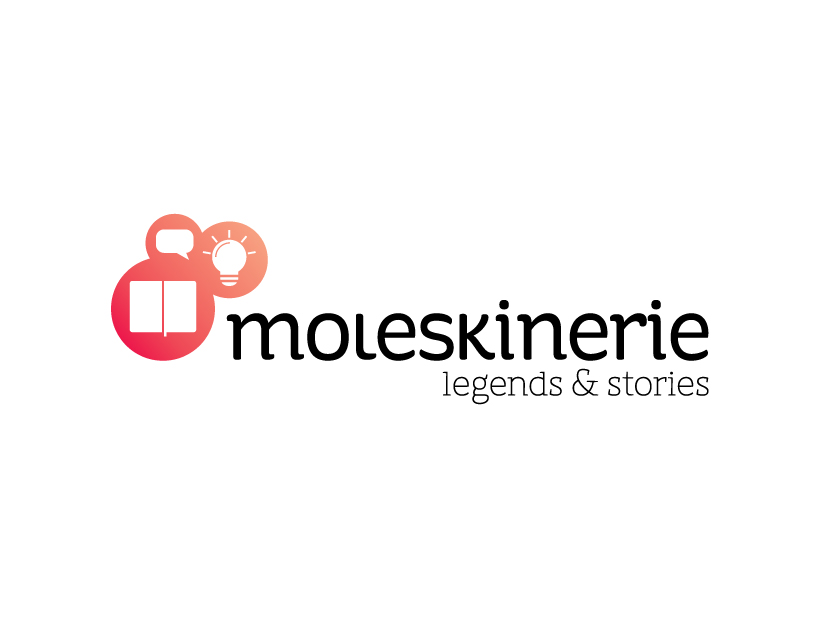
Moleskinerie Logo2 by alanna Pfeffer from usa
designer's own words:
this moleskinerie logo is clean and simple. the elements include a simple, open moleskine silhouette, speech bubbles, and a light bulb. the speech bubble is directed toward the moleskine to show communication and conversation around the product. the lightbulb symbolizes ideas that are born in the moleskine. the customized typeface is lowercase for a more informal feeling as a compliment to the formality of the moleskine logo. it has soft serifs so it doesn't seem overly modernized.
Moleskinerie logo 2 horizontal
shortlisted entries (2162)