moleskinerie logo words and meaning through letters and colour by teresa carro from spain
designer's own words:
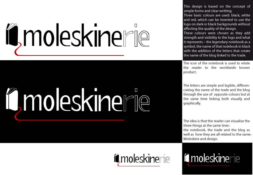
design 01 is based on the concept of simple forms and clear writting.
three basic colours are used: black, white and red, which can be inverted to use the logo on dark or black backgrounds without affecting the quality of the design.
these colours were chosen as they add strength and visibility to the logo and what it represents – the legendary notebook as a symbol, the name of that notebook in black with the addition of the letters that compose the name of the blog related to the trade.
the icon of the book is used to relate the reader to the worldwide known product.
the letters are simple and legible, differenciating the name of the trade and the blog through the use of opposite colours but at the same time linking both visually and graphically.
the idea is that the reader can visualise the three things at the same time : the notebook, the trade and the blog and how they are all related to the same – moleskine and design.
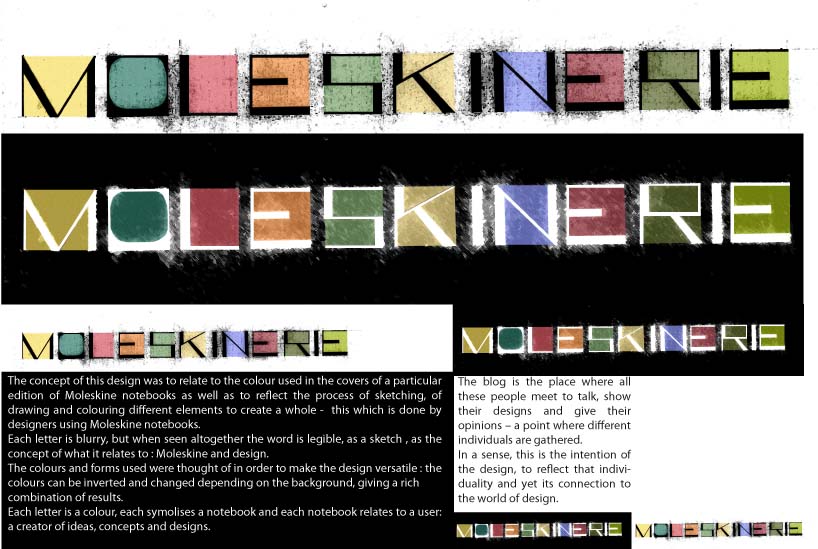
the concept of design 02 was to relate to the colour used in the covers of a particular edition of moleskine notebooks as well as to reflect the process of sketching, of drawing and colouring different elements to create a whole - this which is done by designers using moleskine notebooks.
the lines which define the letters are not clear, but when seen altogether the word is legible, as a sketch , as the concept of what it relates to : moleskine and design.
the colours and forms used were thought of in order to make the design versatile : the colours can be inverted and changed depending on the background, giving a rich combination of results.
each letter is a colour, each symolises a notebook and each notebook relates to a user: a creator of ideas, concepts and designs.
the blog is the place where all these people meet to talk, show their designs and give their opinions – a point where different individuals are gathered.
in a sense, this is the intention of the design, to reflect that individuality and get connection to the world of design.
design 02
 design 01