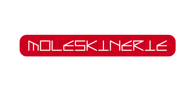
moleskinerie logo with new font by shikui lau from china
designer's own words:
it’s a set of letters evolved from “framework”: composed by two independent, but related systems. the starting point is to view things from different angles, such as, an architecture, or a moleskine notebook. as a font, it processes the possibilities of broader exposure.
the reason of picking this font as logo, is because i believe that moleskinerie has been structuring things in the same way: creating a platform on which other people can participate and interact with each other.
in terms of color, the new logo chooses red. compared to more serious official website, blog is easier to access, more friendly and human-orientied.
although the organizer promised that the works will not be used for commercial purpose, i still made a blog website to demonstrate the features of this logo.
the logo
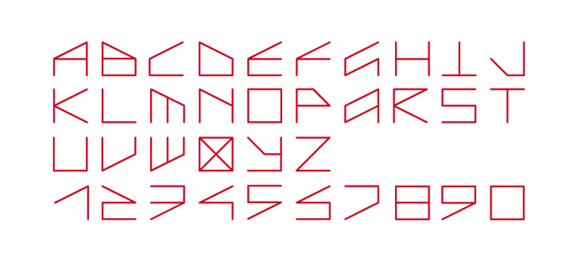 the new font
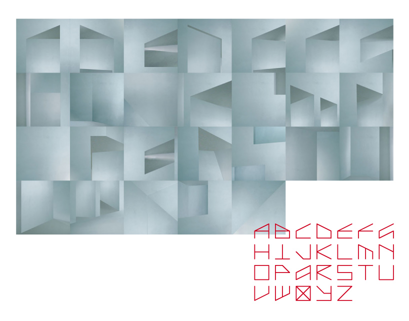 two systems of the font
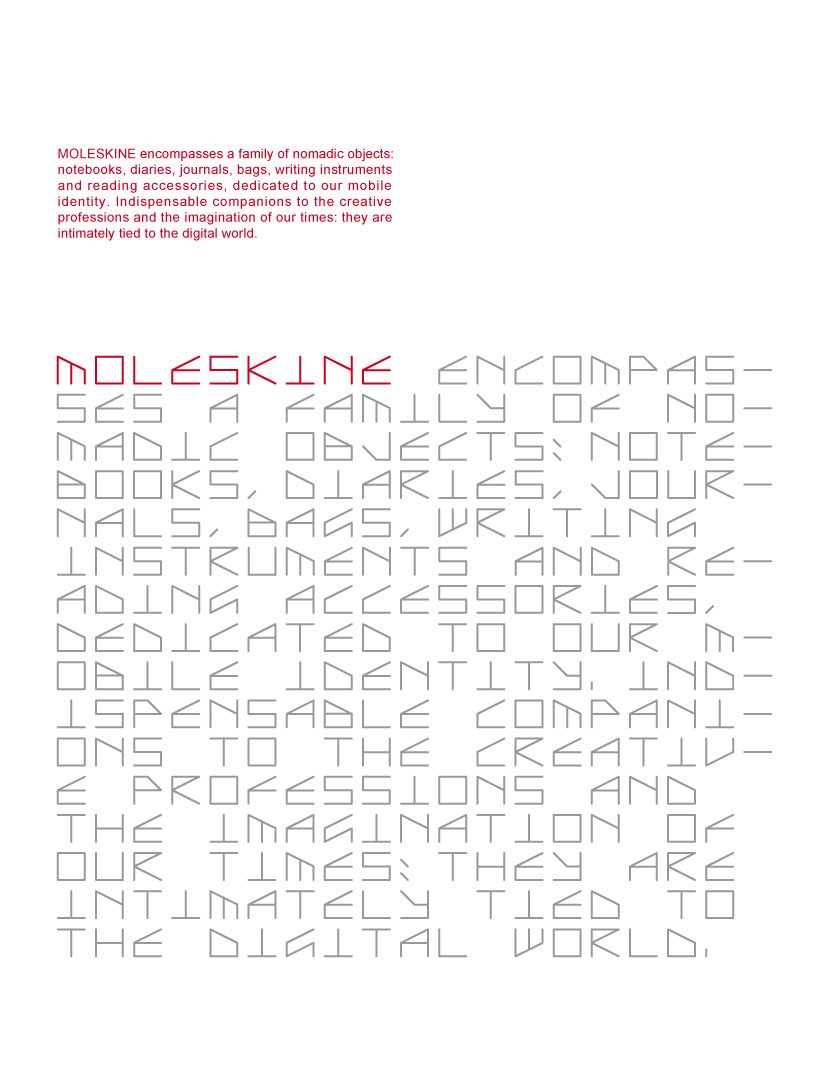 example of system 1
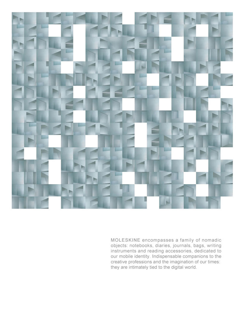 example of system 2
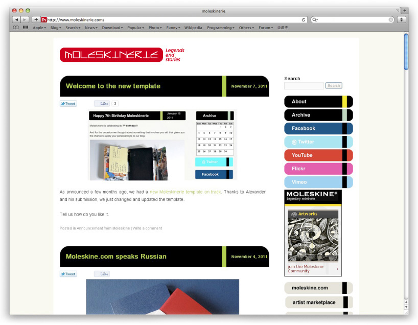 example for using on the web