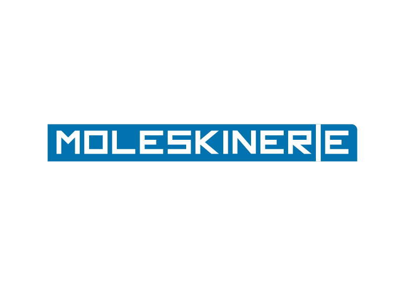
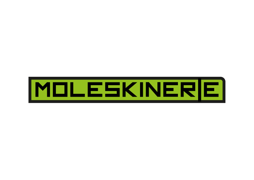
![[moleskinerie logo v3.0] by bruno domingos](https://static.designboom.com/contest/files/moleskinerie_v3_a.jpg)
[moleskinerie logo v3.0] by bruno domingos by bruno domingos from portugal
designer's own words:
the idea is simple. moleskinerie use for there products, a very unique shape. so, having that in mind, i built a logo where the shape is the main feature and the typography is a complement for that. for this logo is used only shapes. the font was created all by me. adobe illustrator was the tool to get the job done. i have submitted several images to illustrate how the logo looks like with colors. combination of colors can be used. i must say that the main shape could be only stroke, filled, or both.
v3_b&w
 v3_fill
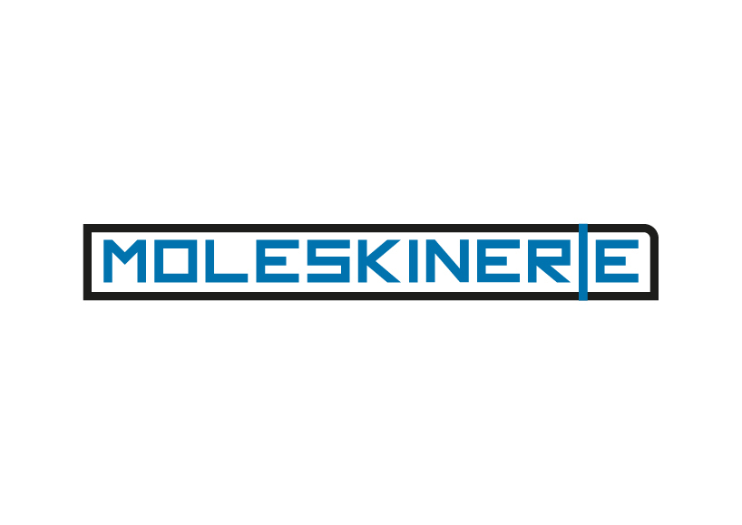 v3_stroke
 v3_fill&stroke
shortlisted entries (2162)