
moleskinerie logo to go by jerry elmore from usa
designer's own words:
in creating a logo for this competition, i wanted to capture the essence of mobility so it only seemed natural to have a logo which was able to express this attribute.
also, it was not until after the initial sketch did i notice the resemblance the logo shared with an elephant. these creatures are well known to have impressive memories much like a favorite sketchbook. and even in this digital age of information, pencil and paper still have a place amongst our latest gadgets proving their historical lifelong companionship alongside us.
grey m / cyan field
 blue m / grey field
 blue m / white field
 black outline / white background
 pink m / white field
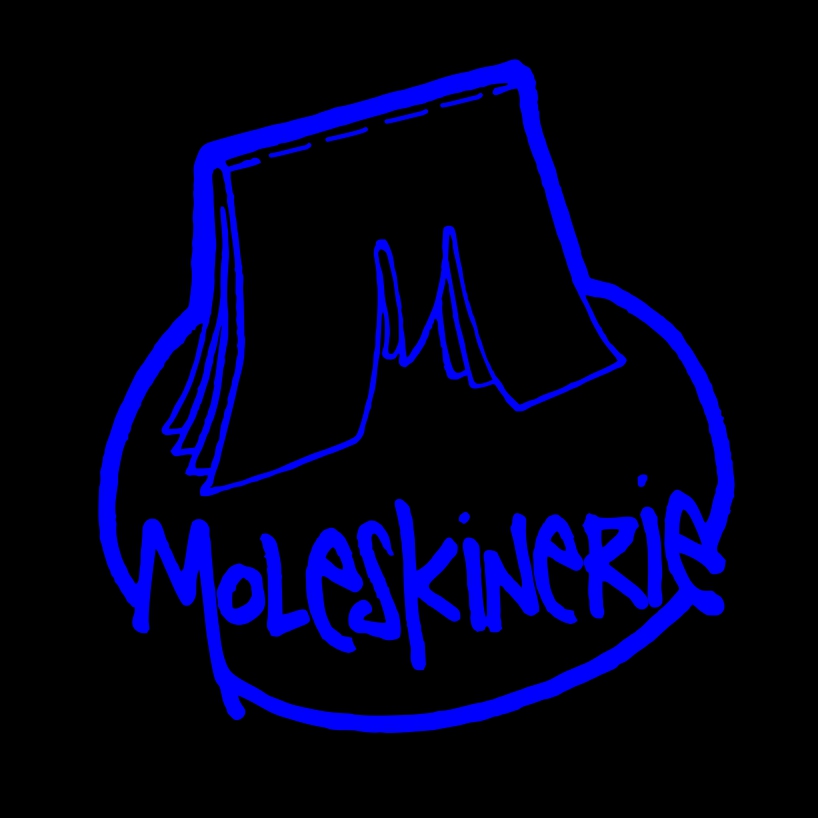 blue outline / black background
shortlisted entries (2162)