Moleskinerie logo The Occam's Razor solution by Andrija Gramatikovski from macedonia
designer's own words:
The Moleskinerie blog is the gathering point for the Moleskine community. It represents an extension of the brand and one has to be able to make this connection based solely on the Moleskinerie brad identity. This is why I introduced the simplified vector shape of a black leather notebook with a green-yellow paper wrapper - a symbol which somehow made it's way into becoming the brands graphic mark, used and recognized by many.
I named this solution "The Occam's Razor" since it is so obvious and simple. I respect simple solutions, they are easy to work with and can be evolved further. This solution adheres to the Moleskine brand and allows visual continuity of the overall brand identity.
Moleskinerie logo
 Moleskinerie logo description
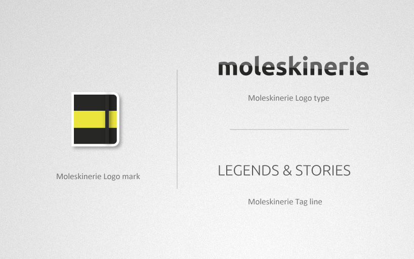 Moleskinerie logo elements
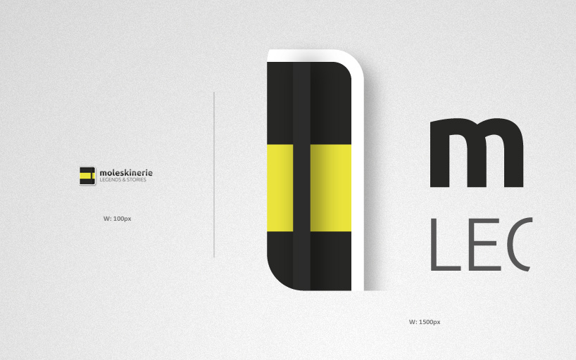 Moleskinerie logo sizes
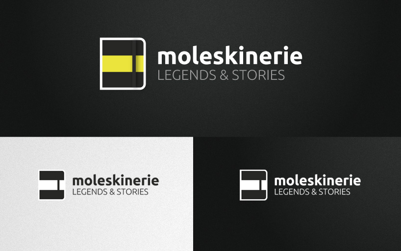 Moleskinerie logo inverted and monochrome
![]() Moleskinerie iPhone App icon
Moleskinerie iPhone App icon