moleskinerie logo "m"otebook by andré teoman ozguler passos from portugal
designer's own words:
this logo, can be classified as a "monogram", it explores the initial of the company name helping the client to get to the full name. an example of this kind of logo can be seen in the abc of american broadcasting company. but this cant only be seen as a monogram because it explores the symbol factor too. using an elaborated "m" so ti would be unique and always easy to spot.
the concept behind this illustration is the main selling product that moleskin sells and knowing that a notebook is were most of the creative people start with their ideas it explores the concept that "moleskinerie can be where your ideas start too". With this kind of logo you will be able to use it in every kind of stuff from internet site to stickers.
with this proposal the image of moleskinerie would be easy to spot by everyone and everywhere.
cover
 logo
logo
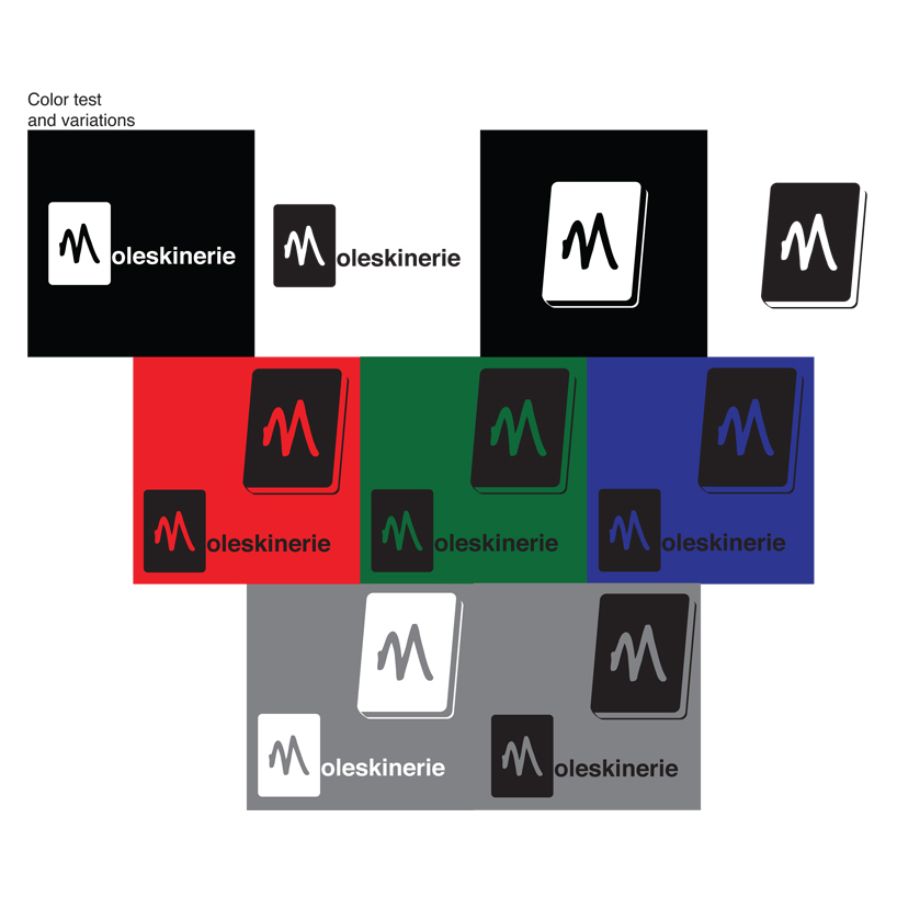
 color test and variations
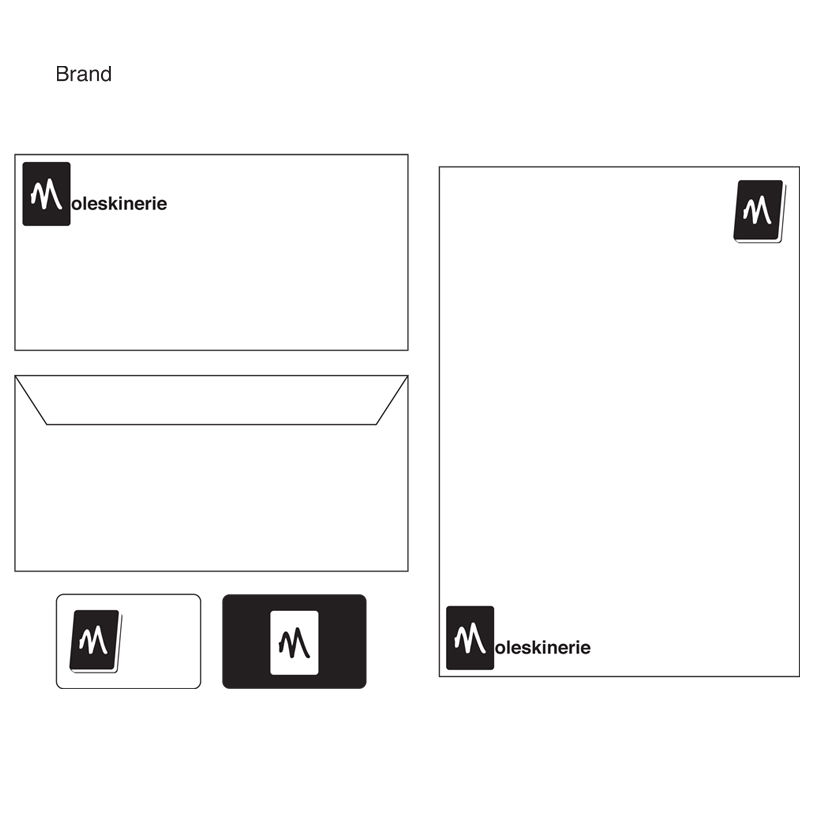
 brand
brand