moleskinerie logo_ miguel pereira by Miguel Pereira miguel_pereira from portugal
designer's own words:
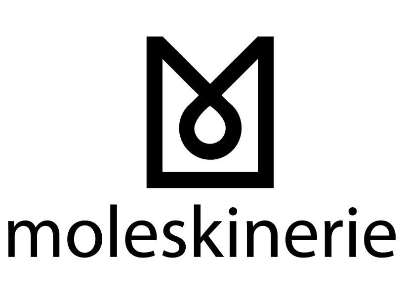
the logo is the fusion of two simple shapes, the rectangle which is associated to the shape of most products of Moleskine and the "m" letter, associated to the first letter of the brand. the final result has a circular shape in the inferior vertex that symbolizes continuity, logically in a general point of view this last circular element will not be associated. overall the final shape reflects the brand product itself about the colours, in a way to facilitate the application of the logo on any background, black was used, which is a neutral color. the size of this graphic element is lightly bigger than the rest of the textual elements in a way to be evident to an easier image memorization.
the logo praises simplicity, quick association and an easier application on the site or any other place using closed black shapes.
logo 1
 logo 1 negative
 logo color
 logo color negative
 logo 2