Moleskinerie Logo in Moleskine Rounded Typeface by Gonzalo Obelleiro from usa
designer's own words:
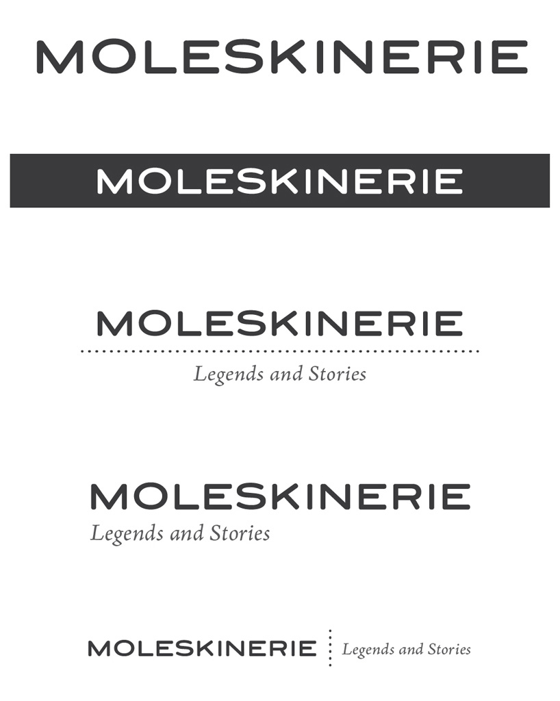
A simple and elegant solution. The brand name is set in an original font design, which I call "Moleskine Rounded." The font is wide, clean, readable, and with a certain softness to it, evoking the round shapes and organic textures of the Moleskine notebooks. This design is intended as a sort of digital update of the Moleskine logo (set in Copperplate).
The simplicity of the design renders it extremely versatile. It can be applied on any color and against almost any background, which is appropriate for a blog as it can easily adapt to different blog themes.
Potentially, the "Moleskine Rounded" could be developed into an entire family of fonts in several weights.
Moleskinerie Logo
 Moleskinerie Logo Variations
 Moleskinerie Blog
 Moleskinerie Blog