Moleskinerie Logo : ‘Embracing ideas to the Brand’ by Warangkhana Hongthong from usa
designer's own words:
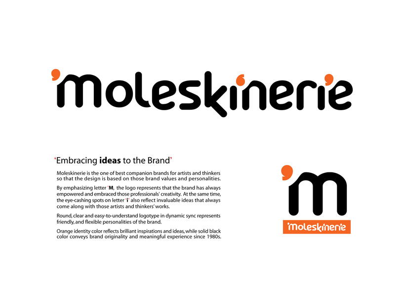
Moleskinerie is the one of best companion brands for artists and thinkers so that the design is based on those brand values and personalities.
By emphasizing letter ’M, the logo represents that the brand has always empowered and embraced those professionals' creativity. At the same time, the eye-cashing spots on letter ‘i’ also reflect invaluable ideas that always come along with those artists and thinkers’ works.
Round, clear and easy-to-understand logotype in dynamic sync represents friendly, and flexible personalities of the brand.
Orange identity color reflects brilliant inspirations and ideas, while solid black color conveys brand originality and meaningful experience since 1980s.
Logo&Concept
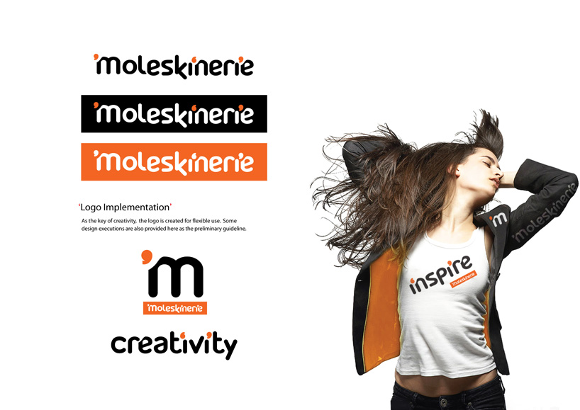 Logo-Preliminary Guidline for Implementation