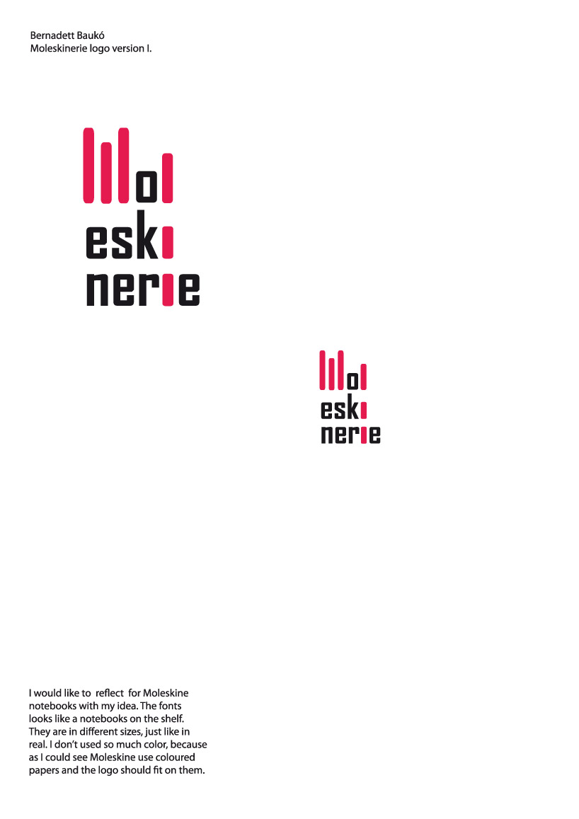
Moleskinerie logo design by Bernadett Bauko from hungary
designer's own words:
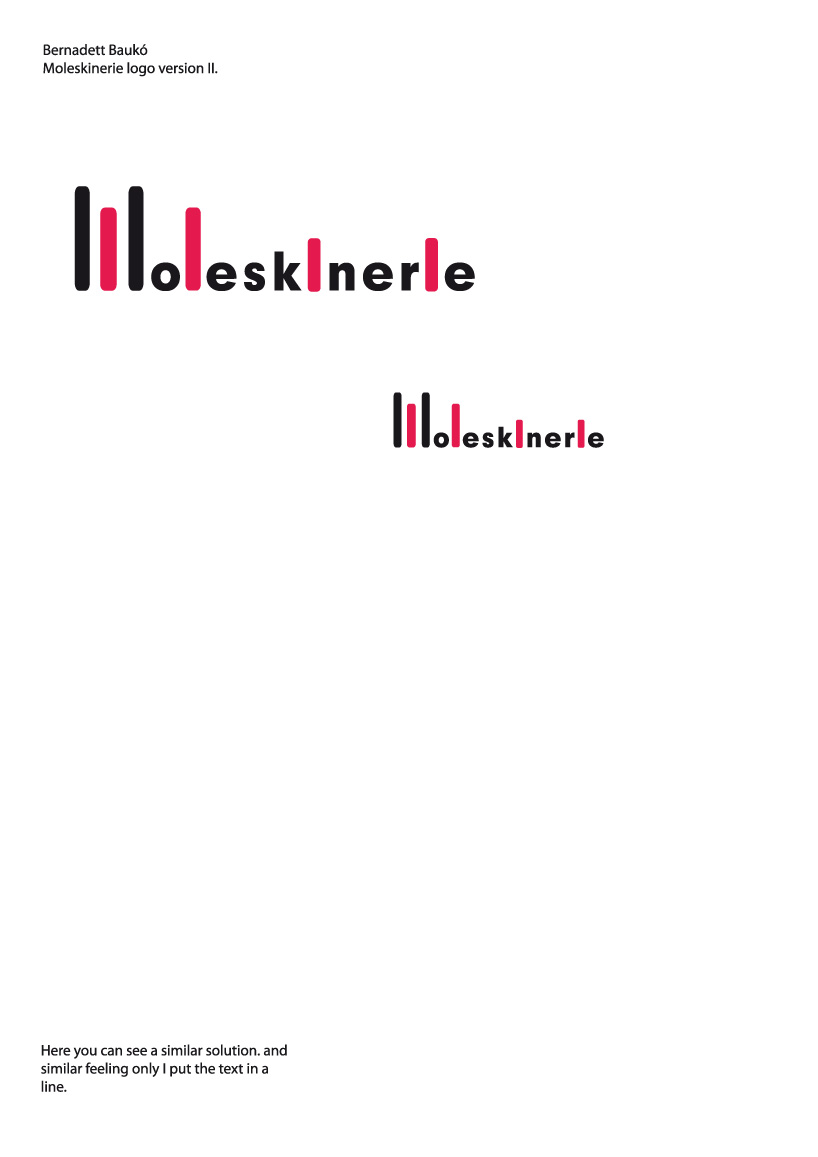
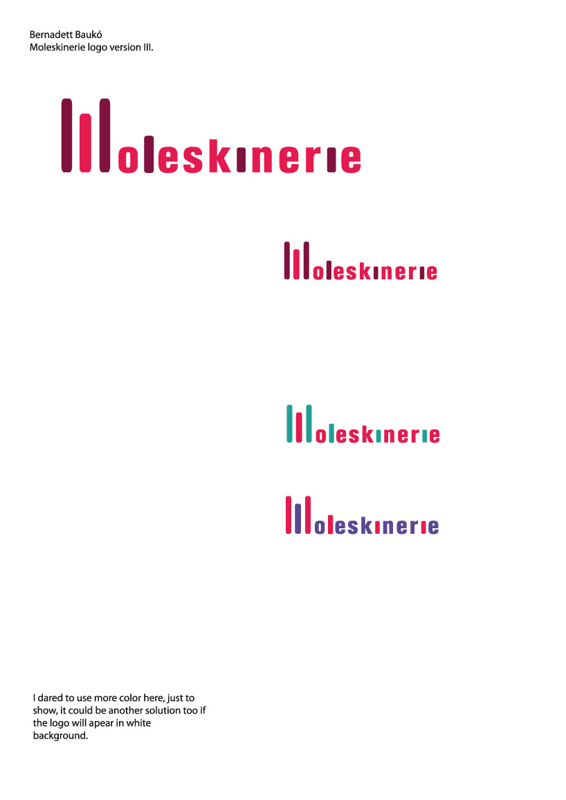
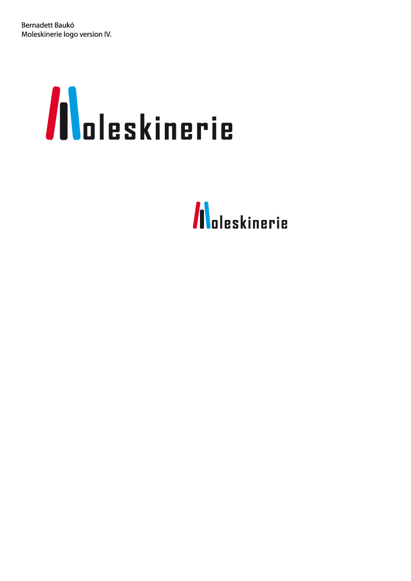
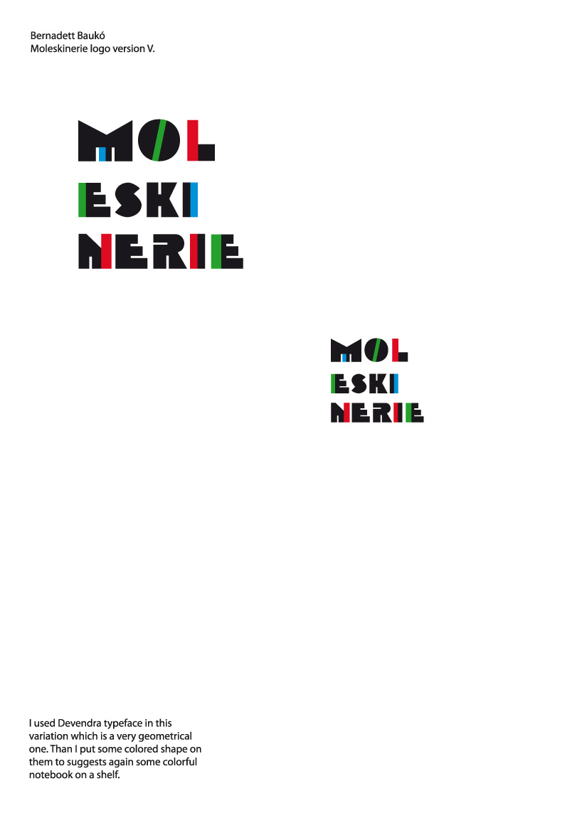
I would like to reflect for Moleskine notebooks with my idea. All of my logos suggests small notebooks like they are standing on the shelf. Because the text is quite long, I tried to cut it somehow. There is a variation where I cut the text this the extra coloured fonts to take it easily to read or I used wrap in the text. Usually I didn’t use so much colors, because as I could see Moleskine use coloured papers on the cover and the logo should fit on them. Anyway I made some colorful variations as well to reflect for Moleskine colorful image if the logo should be on white background. I mainly used geometrical typefaces which can be more ordered and better to read.
shortlisted entries (2162)