moleskinerie logo competition SSCHMIDT design81.com by steve schmidt from australia
designer's own words:
the inspiration for the moleskinerie artwork stems from the moleskine products themselves. considering the moleskinerie blog grew organically through it’s dedicated users and fan base it was an obvious choice for inspiration. the logo comprises of 4 quadrants, each quadrant resembling a moleskine interior and user. the horizontal lines (top left) represent the creative writer, note taker or author who take comfort in the soft lines. the grid pattern (top right) is for the design engineer, precision focused designer or those who embrace the juxtaposition of practicality and freedom of graph pages. the solid box (bottom left) signifies the sketchers, doodlers or those who like to start the page with a blank canvas. the final quadrant depicts the m, a symbol that represents moleskine as the brand that impacts all aspects of its users lives – notebooks, bags, accessories and more.
the logo was created with the same aesthetics as moleskine products – simple, sleek and stylish, with careful design to ensure it can be used in a variety of sizes and formats; online, in print or embossed on product.
moleskinerie logo (RGB)
 moleskinerie logo – variations
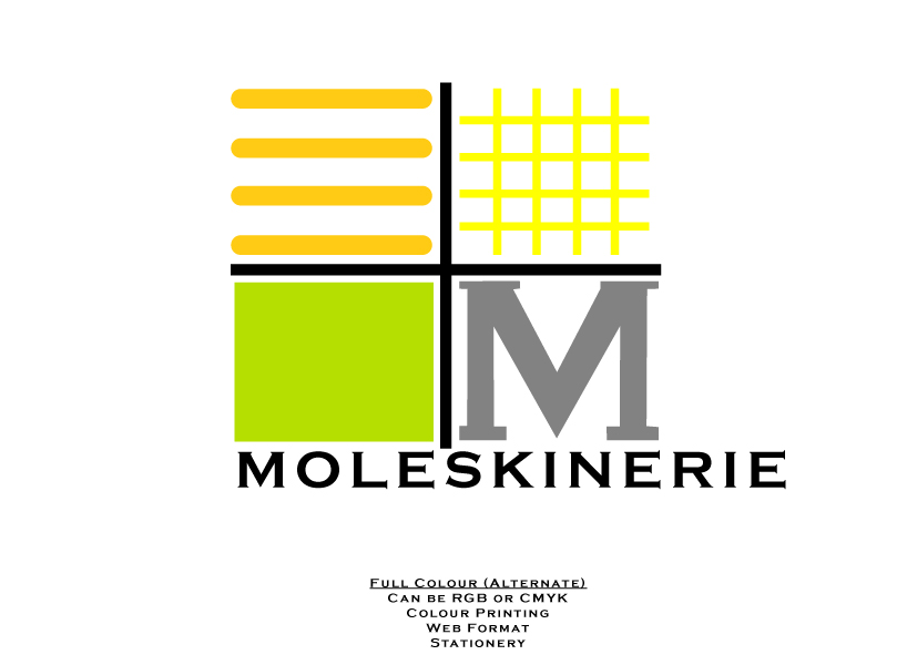 moleskinerie logo (RGB) in alternate colours. this colour format references the band and branding of moleskine notebooks.