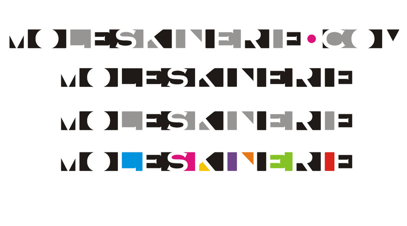
moleskinerie logo competition by nikola todorović from serbia
designer's own words:
this logo is combined of copperplate gothic font (which is the original moleskine font if i’m not mistaken) and a rectangle. i put the logo in front of the rectangle and then intersected them so it forms a stencil-like geometric shades that suggest the name of the logo. i sent few examples of it’s use- various colors can be used or only two, or one…. also i wasn’t sure if i should include .com in the logo so i made two versions with and without that part.
shortlisted entries (2162)