moleskinerie logo competition by nikola todorović from serbia
designer's own words:
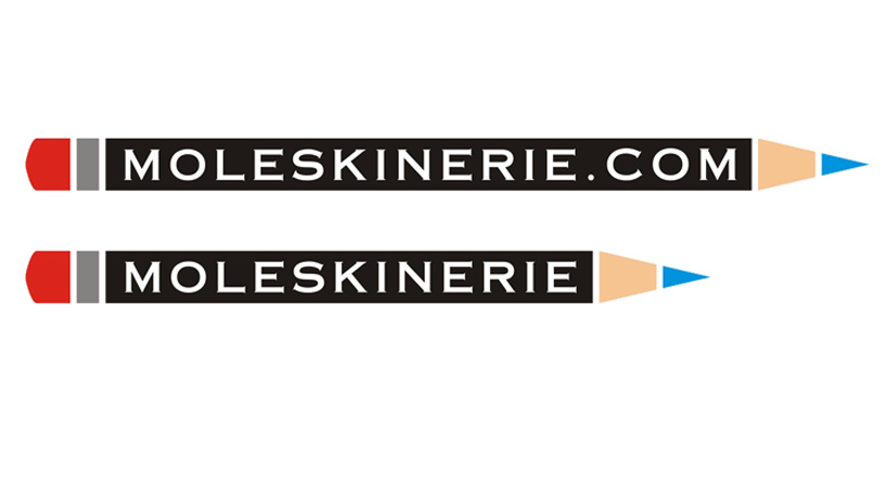
this logo is combined of copperplate gothic font (which is the original moleskine font if i’m not mistaken) and a graphically illustrated pencil.the colors can be changed however one desires. also i wasn’t sure if i should include .com in the logo so i made two versions with and without that part.
the basic idea was to create something that would represent blog writing so i chose a pencil with a logo (brand’s original font was intended) inside it.
shortlisted entries (2162)