Moleskinerie Logo by Simons by joao simons from germany
designer's own words:
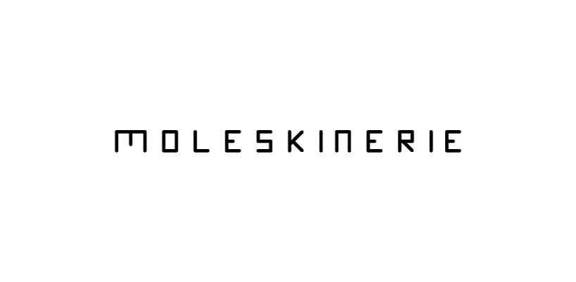
My logo express the brief that was submitted. A clean, simple, modern one color logo.
I inspired myself in the simplicity of logo and type creation of our ancestors. I started to build the letters based on the moleskine notebook cover, with the upper and down right corners rounded. The very start of the logo (the M letter) it is a open moleskine notebook.
I tried not to distance myself from the current logo cause i think it reflects moleskine thinking. So I designed this logo that can be used in any platform possible, works very well on backgrounds, it is readable, it is sophisticated, modern and I really can imagine this carved in a moleskine notebook.
As for techniques, I used millimetric paper for the logo and typre design, and after illustrator for digital creation.
Thank you,
Simons
Round Moleskinerie
 Round Moleskinerie B
 Square Moleskinerie
 Square Moleskinerie B
 Caps Moleskinerie
 Caps Moleskinerie B