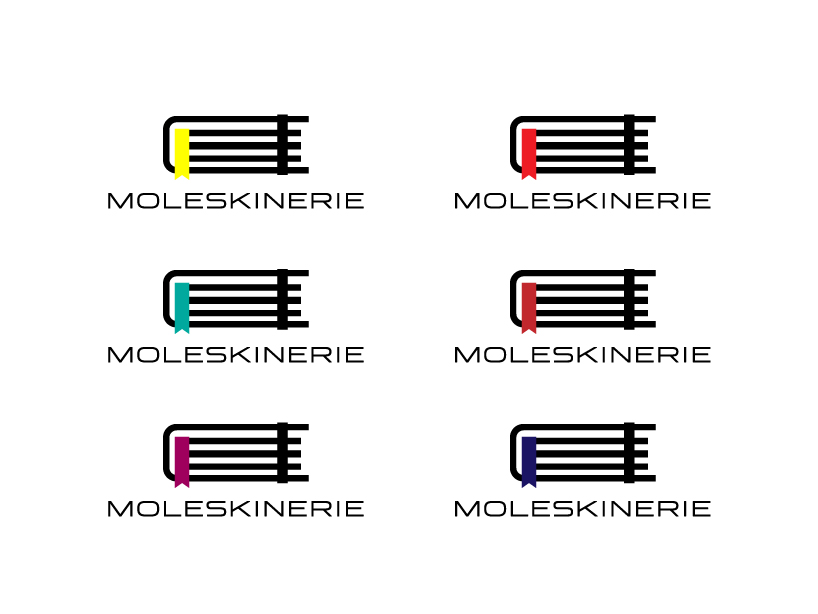
moleskinerie logo by karen santiago by karen santiago from mexico
designer's own words:
the moleskine notebook is an icon itself. why not use it to represent the moleskinerie blog? those were the first words that came to my head and decided to create a logo based on the notebook, trying to keep the essence of it, but making it as abstact as possible. the typography is simple, easy to read and comprehend. the logo works great on single inks and is easy to reproduce and identify.
logo
 contrast
 color codes
shortlisted entries (2162)