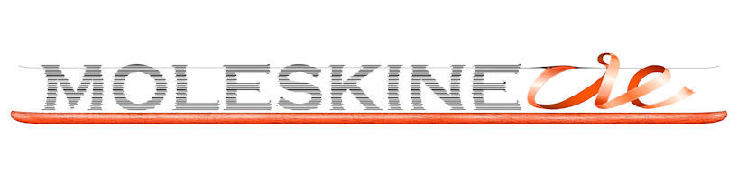
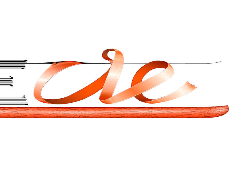
moleskinerie logo by joanne de witte by joanne from netherlands
designer's own words:
my design of the moleskinerie logo is based on a moleskine notebook and the original moleskine logo. combining those two things was essential to me in order to represent moleskinerie because they form the foundation of it. aside from being a logo, this design gives the viewer the illusion of looking at a moleskine notebook from the side. therefore it stands for the image of moleskine and gives a clear view of what moleskine is about. the ribbon spells ‘rie’ and completes the logo to ‘moleskinerie’. it’s design stands out from ‘moleskine’ because moleskine is ultimately what moleskinerie is about, and to me this should be separated in the logo.
shortlisted entries (2162)