Moleskinerie logo and typeface _ Joana Pais by Pais Joana from portugal
designer's own words:
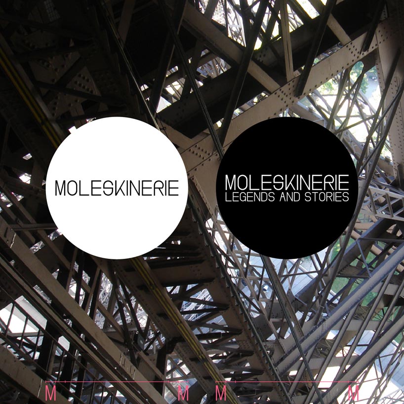
The Moleskinerie logo, for which it was created an exclusive typeface for its own use, in two versions, LIGHT and REGULAR, with the variant ALTERNATE, in which changes the R and the S (meant for easier mass text reading, to use in the slogan "legends and stories", and to differentiate the logo typography from the rest).
The font is a sans-serif as one of the parameters of the contest required the use for screen.
The base of the shape of the letters comes from the rectangular shape of the Moleskine notebooks, and the grid has been "taken" from the squared notebooks.
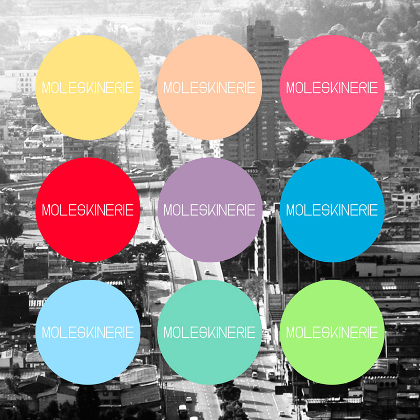
Beyond the white and black versions, the other nine possibilities of color were inspired by the color range of Moleskine.
It's a versatile logo that can be applied to any type of background, colored, over image or photograph, because in case of need it has the protection area circle around it, giving the logo character and standing out for its simplicity.
The logo can be used in the MOLESKINERIE SANS_LIGHT version, or the MOLESKINERIE SANS_REGULAR version, if there are complex backgrounds or if it's necessary its reduction.
Moleskinerie – 01
 Moleskinerie – 02
 Moleskinerie – 03
 Moleskinerie – 04
 Moleskinerie – 05
 Moleskinerie – 06