moleskinerie logo by Broono Rodrigues from portugal
designer's own words:
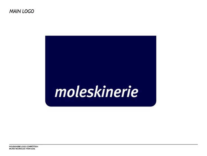
the logo defined for the moleskinerie brand, is a simplification of shapes. from a moleskine notebook was made a redesign simplified from the top of the object with the aim of creating a base form that would support and create an identifying symbol. the typographic element comes from the famous traditional elastic that moleskine doesn't dispense. from there, a position was defined by a measure equivalent to the height of x of the applied font. this logo can be used on the edge of images individually or in any other position. this is a characteristic logo that links the moleskinerie community to the primary identity of this world (moleskine). the typography used was myriad italic, given their potential for web application, from the quick readability to the simple trace for a good perception in minimum dimensions.
main logo
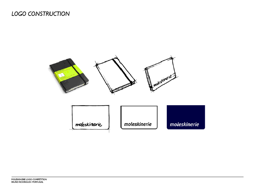 logo construction
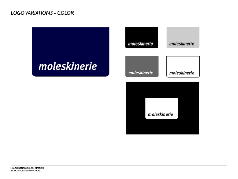 logo variations – color
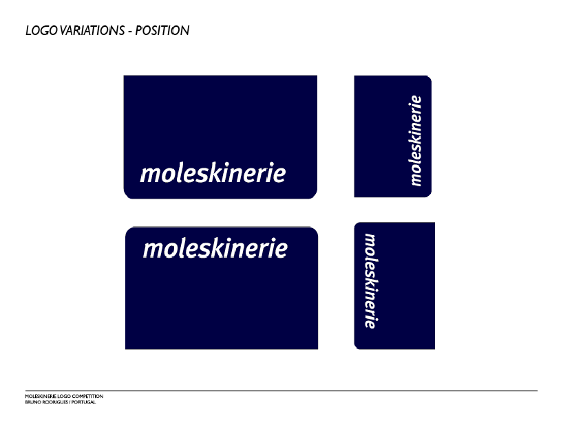 logo variations – position
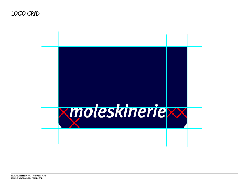 logo grid
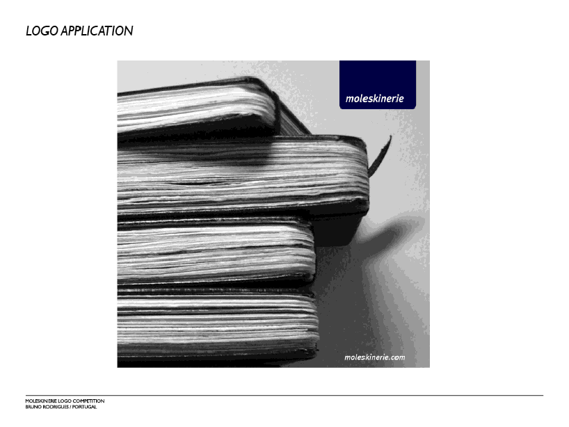 logo application