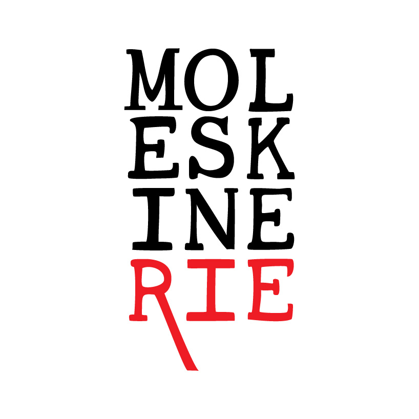
moleskinerie logo by tiago jesus from portugal
designer's own words:
it’s all about the notebook.
all the stories, the drawings, the words they all have one thing in common: a moleskine notebook.
moleskinerie is a place to share all those things, it’s your “online notebook” about notebooks.
since that’s where it all starts, then that’s where the logo should start too.
the logo assumes a vertical form, relating to the most common of the moleskine notebooks. The lettering is all handrawn, as if it was a sketch in the notebook. The breaking of the word ‘moleskinerie’ relates to the popular small pocket-type format of the notebooks.
The last line of the logo appears in a different color to emphasize the ‘rie’ part, giving strenght to name of the blog, beyond the moleskine trade mark.
alternative colors are available to use in different applications, either relating to different uses of a notebook (text, drawing, technical drawing, painting, etc.) or depending on the color context where the logo is to be applyed.
also available are an horizontal version of the logo, and a version with a black background - assuming the actual shape of the notebook, including its characteristic rounded corners - to use in busy backgrounds.
main logo
 alternative colors and monochrome and negative versions
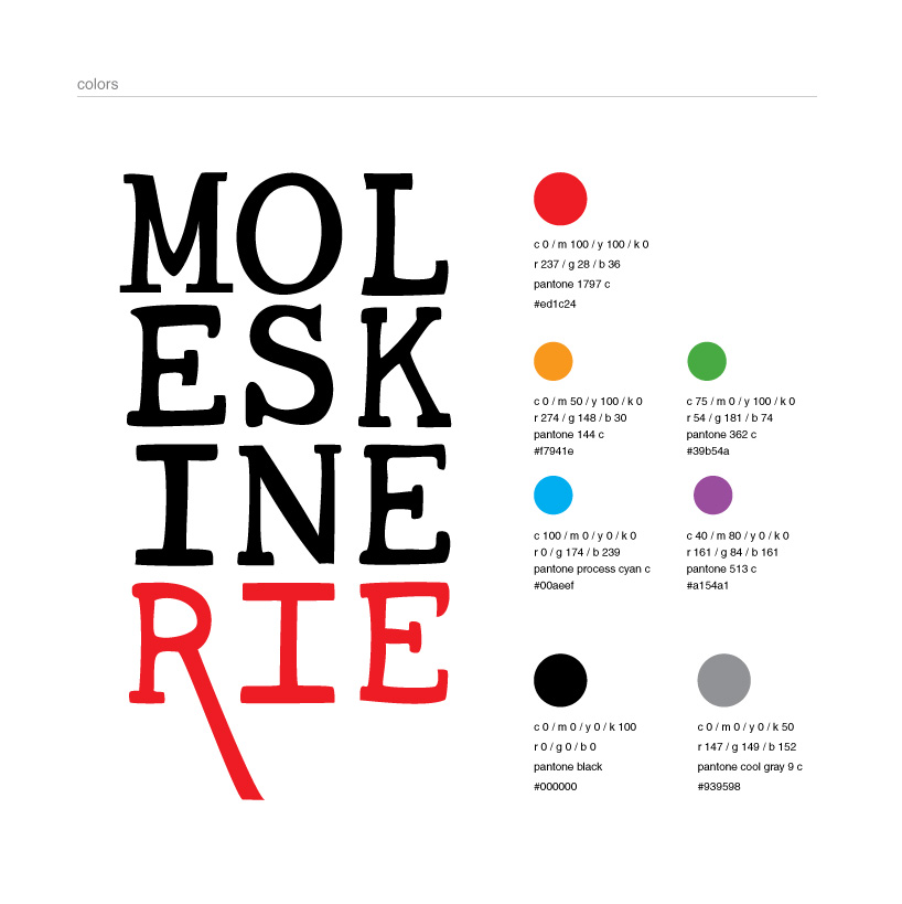 color information
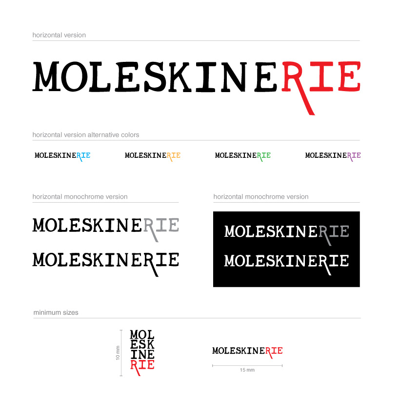 horizontal version, with respectiove alternate colors and both monochrome and negative versions and minumium size of application
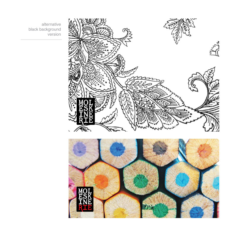 alternative black backround version
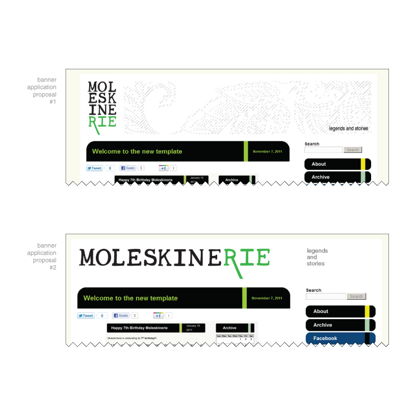 simulation of the application in the blog banner