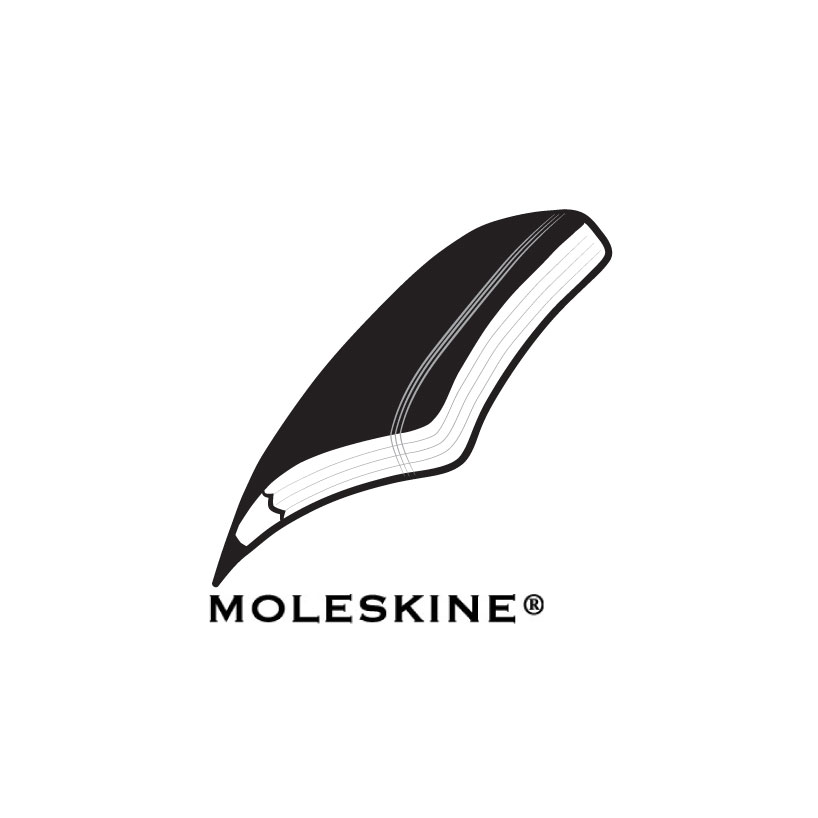
moleskinerie logo by milan radovic from serbia
designer's own words:
this logo is pen inspired. basically, it’s a diary with a pencil, styled along the edge of the diary which makes a silhouette of an old pen.
i wanted to stay ‘in story’ with memorable moleskine planners. also, i wanted it to be simple, but well-thought logo which can leave a deep impression for the public.
This logo is pen inspired. Basically, it’s a diary with a pencil, styled along the edge of the diary which makes a silhouette of an old pen. I wanted to stay ‘in story’ with memorable Moleskine planners. Also, I wanted it to be simple, but well-thought lo
 This logo is pen inspired. Basically, it’s a diary with a pencil, styled along the edge of the diary which makes a silhouette of an old pen. I wanted to stay ‘in story’ with memorable Moleskine planners. Also, I wanted it to be simple, but well-thought lo
 This logo is pen inspired. Basically, it’s a diary with a pencil, styled along the edge of the diary which makes a silhouette of an old pen. I wanted to stay ‘in story’ with memorable Moleskine planners. Also, I wanted it to be simple, but well-thought lo
 This logo is pen inspired. Basically, it’s a diary with a pencil, styled along the edge of the diary which makes a silhouette of an old pen. I wanted to stay ‘in story’ with memorable Moleskine planners. Also, I wanted it to be simple, but well-thought lo
 This logo is pen inspired. Basically, it’s a diary with a pencil, styled along the edge of the diary which makes a silhouette of an old pen. I wanted to stay ‘in story’ with memorable Moleskine planners. Also, I wanted it to be simple, but well-thought lo
 This logo is pen inspired. Basically, it’s a diary with a pencil, styled along the edge of the diary which makes a silhouette of an old pen. I wanted to stay ‘in story’ with memorable Moleskine planners. Also, I wanted it to be simple, but well-thought lo